ardouradvice
sideblog for @letardoursprout so i have somewhere to collect all the tutorials/advice that i likeicon by lovelyshiz. header by hexh-pixel
66 posts
Latest Posts by ardouradvice
⭐ So you want to learn pixel art? ⭐
🔹 Part 1 of ??? - The Basics!
Edit: Now available in Google Doc format if you don't have a Tumblr account 🥰
Hello, my name is Tofu and I'm a professional pixel artist. I have been supporting myself with freelance pixel art since 2020, when I was let go from my job during the pandemic.


My progress, from 2017 to 2024. IMO the only thing that really matters is time and effort, not some kind of natural talent for art.
This guide will not be comprehensive, as nobody should be expected to read allat. Instead I will lean heavily on my own experience, and share what worked for me, so take everything with a grain of salt. This is a guide, not a tutorial. Cheers!
🔹 Do I need money?
NO!!! Pixel art is one of the most accessible mediums out there.
I still use a mouse because I prefer it to a tablet! You won't be at any disadvantage here if you can't afford the best hardware or software.
Because our canvases are typically very small, you don't need a good PC to run a good brush engine or anything like that.
✨Did you know? One of the most skilled and beloved pixel artists uses MS PAINT! Wow!!
🔹 What software should I use?
Here are some of the most popular programs I see my friends and peers using. Stars show how much I recommend the software for beginners! ⭐
💰 Paid options:
⭐⭐⭐ Aseprite (for PC) - $19.99
This is what I and many other pixel artists use. You may find when applying to jobs that they require some knowledge of Aseprite. Since it has become so popular, companies like that you can swap raw files between artists.
Aseprite is amazingly customizable, with custom skins, scripts and extensions on Itch.io, both free and paid.
If you have ever used any art software before, it has most of the same features and should feel fairly familiar to use. It features a robust animation suite and a tilemap feature, which have saved me thousands of hours of labour in my work. The software is also being updated all the time, and the developers listen to the users. I really recommend Aseprite!
⭐ Photoshop (for PC) - Monthly $$
A decent option for those who already are used to the PS interface. Requires some setup to get it ready for pixel-perfect art, but there are plenty of tutorials for doing so.
Animation is also much more tedious on PS which you may want to consider before investing time!
⭐⭐ ProMotion NG (for PC) - $19.00
An advanced and powerful software which has many features Aseprite does not, including Colour Cycling and animated tiles.
⭐⭐⭐ Pixquare (for iOS) - $7.99 - $19.99 (30% off with code 'tofu'!!)
Probably the best app available for iPad users, in active development, with new features added all the time.

Look! My buddy Jon recommends it highly, and uses it often.
One cool thing about Pixquare is that it takes Aseprite raw files! Many of my friends use it to work on the same project, both in their office and on the go.
⭐ Procreate (for iOS) - $12.99
If you have access to Procreate already, it's a decent option to get used to doing pixel art. It does however require some setup. Artist Pixebo is famously using Procreate, and they have tutorials of their own if you want to learn.
⭐⭐ ReSprite iOS and Android. (free trial, but:) $19.99 premium or $$ monthly
ReSprite is VERY similar in terms of UI to Aseprite, so I can recommend it. They just launched their Android release!
🆓 Free options:
⭐⭐⭐ Libresprite (for PC)
Libresprite is an alternative to Aseprite. It is very, very similar, to the point where documentation for Aseprite will be helpful to Libresprite users.
⭐⭐ Pixilart (for PC and mobile)
A free in-browser app, and also a mobile app! It is tied to the website Pixilart, where artists upload and share their work. A good option for those also looking to get involved in a community.
⭐⭐ Dotpict (for mobile)
Dotpict is similar to Pixilart, with a mobile app tied to a website, but it's a Japanese service. Did you know that in Japanese, pixel art is called 'Dot Art'? Dotpict can be a great way to connect with a different community of pixel artists! They also have prompts and challenges often.
🔹 So I got my software, now what?
◽Nice! Now it's time for the basics of pixel art.
❗ WAIT ❗ Before this section, I want to add a little disclaimer. All of these rules/guidelines can be broken at will, and some 'no-nos' can look amazing when done intentionally.
The pixel-art fundamentals can be exceedingly helpful to new artists, who may feel lost or overwhelmed by choice. But if you feel they restrict you too harshly, don't force yourself! At the end of the day it's your art, and you shouldn't try to contort yourself into what people think a pixel artist 'should be'. What matters is your own artistic expression. 💕👍
◽Phew! With that out of the way...
🔸"The Rules"
There are few hard 'rules' of pixel art, mostly about scaling and exporting. Some of these things will frequently trip up newbies if they aren't aware, and are easy to overlook.
🔹Scaling method
There are a couple ways of scaling your art. The default in most art programs, and the entire internet, is Bi-linear scaling, which usually works out fine for most purposes. But as pixel artists, we need a different method.


Both are scaled up x10. See the difference?
On the left is scaled using Bilinear, and on the right is using Nearest-Neighbor. We love seeing those pixels stay crisp and clean, so we use nearest-neighbor.
(Most pixel-art programs have nearest-neighbor enabled by default! So this may not apply to you, but it's important to know.)
🔹Mixels
Mixels are when there are different (mixed) pixel sizes in the same image.

Here I have scaled up my art- the left is 200%, and the right is 150%. Yuck!
As we can see, the "pixel" sizes end up different. We generally try to scale our work by multiples of 100 - 200%, 300% etc. rather than 150%. At larger scales however, the minute differences in pixel sizes are hardly noticeable!
Mixels are also sometimes seen when an artist scales up their work, then continues drawing on it with a 1 pixel brush.

Many would say that this is not great looking! This type of pixels can be indicative of a beginner artist. But there are plenty of creative pixel artists out there who mixels intentionally, making something modern and cool.
🔹Saving Your Files
We usually save our still images as .PNGs as they don’t create any JPEG artifacts or loss of quality. It's a little hard to see here, but there are some artifacts, and it looks a little blurry. It also makes the art very hard to work with if we are importing a JPEG.

For animations .GIF is good, but be careful of the 256 colour limit. Try to avoid using too many blending mode layers or gradients when working with animations. If you aren’t careful, your animation could flash afterwards, as the .GIF tries to reduce colours wherever it can. It doesn’t look great!

Here's an old piece from 2021 where I experienced .GIF lossiness, because I used gradients and transparency, resulting in way too many colours.
🔹Pixel Art Fundamentals - Techniques and Jargon
❗❗Confused about Jaggies? Anti-Aliasing? Banding? Dithering? THIS THREAD is for you❗❗ << it's a link, click it!!
As far as I'm concerned, this is THE tutorial of all time for understanding pixel art. These are techniques created and named by the community of people who actually put the list together, some of the best pixel artists alive currently. Please read it!!
🔸How To Learn
Okay, so you have your software, and you're all ready to start. But maybe you need some more guidance? Try these tutorials and resources! It can be helpful to work along with a tutorial until you build your confidence up.
⭐⭐ Pixel Logic (A Digital Book) - $10 A very comprehensive visual guide book by a very skilled and established artist in the industry. I own a copy myself.
⭐⭐⭐ StudioMiniBoss - free A collection of visual tutorials, by the artist that worked on Celeste! When starting out, if I got stuck, I would go and scour his tutorials and see how he did it.
⭐ Lospec Tutorials - free A very large collection of various tutorials from all over the internet. There is a lot to sift through here if you have the time.
⭐⭐⭐ Cyangmou's Tutorials - free (tipping optional) Cyangmou is one of the most respected and accomplished modern pixel artists, and he has amassed a HUGE collection of free and incredibly well-educated visual tutorials. He also hosts an educational stream every week on Twitch called 'pixelart for beginners'.
⭐⭐⭐ Youtube Tutorials - free There are hundreds, if not thousands of tutorials on YouTube, but it can be tricky to find the good ones. My personal recommendations are MortMort, Brandon, and AdamCYounis- these guys really know what they're talking about!
🔸 How to choose a canvas size
When looking at pixel art turorials, we may see people suggest things like 16x16, 32x32 and 64x64. These are standard sizes for pixel art games with tiles. However, if you're just making a drawing, you don't necessarily need to use a standard canvas size like that.
What I like to think about when choosing a canvas size for my illustrations is 'what features do I think it is important to represent?' And make my canvas as small as possible, while still leaving room for my most important elements.
Imagine I have characters in a scene like this:

I made my canvas as small as possible (232 x 314), but just big enough to represent the features and have them be recognizable (it's Good Omens fanart 😤)!! If I had made it any bigger, I would be working on it for ever, due to how much more foliage I would have to render.
If you want to do an illustration and you're not sure, just start at somewhere around 100x100 - 200x200 and go from there.
It's perfectly okay to crop your canvas, or scale it up, or crunch your art down at any point if you think you need a different size. I do it all the time! It only takes a bit of cleanup to get you back to where you were.
🔸Where To Post
Outside of just regular socials, Twitter, Tumblr, Deviantart, Instagram etc, there are a few places that lean more towards pixel art that you might not have heard of.
⭐ Lospec Lospec is a low-res focused art website. Some pieces get given a 'monthly masterpiece' award. Not incredibly active, but I believe there are more features being added often.
⭐⭐ Pixilart Pixilart is a very popular pixel art community, with an app tied to it. The community tends to lean on the young side, so this is a low-pressure place to post with an relaxed vibe.
⭐⭐ Pixeljoint Pixeljoint is one of the big, old-school pixel art websites. You can only upload your art unscaled (1x) because there is a built-in zoom viewer. It has a bit of a reputation for being elitist (back in the 00s it was), but in my experience it's not like that any more. This is a fine place for a pixel artist to post if they are really interested in learning, and the history. The Hall of Fame has some of the most famous / impressive pixel art pieces that paved the way for the work we are doing today.
⭐⭐⭐ Cafe Dot Cafe Dot is my art server so I'm a little biased here. 🍵 It was created during the recent social media turbulence. We wanted a place to post art with no algorithms, and no NFT or AI chuds. We have a heavy no-self-promotion rule, and are more interested in community than skill or exclusivity. The other thing is that we have some kind of verification system- you must apply to be a Creator before you can post in the Art feed, or use voice. This helps combat the people who just want to self-promo and dip, or cause trouble, as well as weed out AI/NFT people. Until then, you are still welcome to post in any of the threads or channels. There is a lot to do in Cafe Dot. I host events weekly, so check the threads!
⭐⭐/r/pixelart The pixel art subreddit is pretty active! I've also heard some of my friends found work through posting here, so it's worth a try if you're looking. However, it is still Reddit- so if you're sensitive to rude people, or criticism you didn't ask for, you may want to avoid this one. Lol
🔸 Where To Find Work
You need money? I got you! As someone who mostly gets scouted on social media, I can share a few tips with you:
Put your email / portfolio in your bio Recruiters don't have all that much time to find artists, make it as easy as possible for someone to find your important information!
Clean up your profile If your profile feed is all full of memes, most people will just tab out rather than sift through. Doesn't apply as much to Tumblr if you have an art tag people can look at.
Post regularly, and repost Activity beats everything in the social media game. It's like rolling the dice, and the more you post the more chances you have. You have to have no shame, it's all business baby
Outside of just posting regularly and hoping people reach out to you, it can be hard to know where to look. Here are a few places you can sign up to and post around on.
/r/INAT INAT (I Need A Team) is a subreddit for finding a team to work with. You can post your portfolio here, or browse for people who need artists.
/r/GameDevClassifieds Same as above, but specifically for game-related projects.
Remote Game Jobs / Work With Indies Like Indeed but for game jobs. Browse them often, or get email notifications.
VGen VGen is a website specifically for commissions. You need a code from another verified artist before you can upgrade your account and sell, so ask around on social media or ask your friends. Once your account is upgraded, you can make a 'menu' of services people can purchase, and they send you an offer which you are able to accept, decline, or counter.
The evil websites of doom: Fiverr and Upwork I don't recommend them!! They take a big cut of your profit, and the sites are teeming with NFT and AI people hoping to make a quick buck. The site is also extremely oversaturated and competitive, resulting in a race to the bottom (the cheapest, the fastest, doing the most for the least). Imagine the kind of clients who go to these websites, looking for the cheapest option. But if you're really desperate...
🔸 Community
I do really recommend getting involved in a community. Finding like-minded friends can help you stay motivated to keep drawing. One day, those friends you met when you were just starting out may become your peers in the industry. Making friends is a game changer!
Discord servers Nowadays, the forums of old are mostly abandoned, and people split off into many different servers. Cafe Dot, Pixel Art Discord (PAD), and if you can stomach scrolling past all the AI slop, you can browse Discord servers here.
Twitch Streams Twitch has kind of a bad reputation for being home to some of the more edgy gamers online, but the pixel art community is extremely welcoming and inclusive. Some of the people I met on Twitch are my friends to this day, and we've even worked together on different projects! Browse pixel art streams here, or follow some I recommend: NickWoz, JDZombi, CupOhJoe, GrayLure, LumpyTouch, FrankiePixelShow, MortMort, Sodor, NateyCakes, NyuraKim, ShinySeabass, I could go on for ever really... There are a lot of good eggs on Pixel Art Twitch.
🔸 Other Helpful Websites
Palettes Lospec has a huge collection of user-made palettes, for any artist who has trouble choosing their colours, or just wants to try something fun. Rejected Palettes is full of palettes that didn't quite make it onto Lospec, ran by people who believe there are no bad colours.
The Spriters Resource TSR is an incredible website where users can upload spritesheets and tilesets from games. You can browse for your favourite childhood game, and see how they made it! This website has helped me so much in understanding how game assets come together in a scene.
VGMaps Similar to the above, except there are entire maps laid out how they would be played. This is incredible if you have to do level design, or for mocking up a scene for fun.
Game UI Database Not pixel-art specific, but UI is a very challenging part of graphics, so this site can be a game-changer for finding good references!
Retronator A digital newspaper for pixel-art lovers! New game releases, tutorials, and artworks!
Itch.io A website where people can upload, games, assets, tools... An amazing hub for game devs and game fans alike. A few of my favourite tools: Tiled, PICO-8, Pixel Composer, Juice FX, Magic Pencil for Aseprite
🔸 The End?
This is just part 1 for now, so please drop me a follow to see any more guides I release in the future. I plan on doing some writeups on how I choose colours, how to practise, and more!
I'm not an expert by any means, but everything I did to get to where I am is outlined in this guide. Pixel art is my passion, my job and my hobby! I want pixel art to be recognized everywhere as an art-form, a medium of its own outside of game-art or computer graphics!
This guide took me a long time, and took a lot of research and experience. Consider following me or supporting me if you are feeling generous.
And good luck to all the fledgling pixel artists, I hope you'll continue and have fun. I hope my guide helped you, and don't hesitate to send me an ask if you have any questions! 💕
My other tutorials (so far): How to draw Simple Grass for a game Hue Shifting
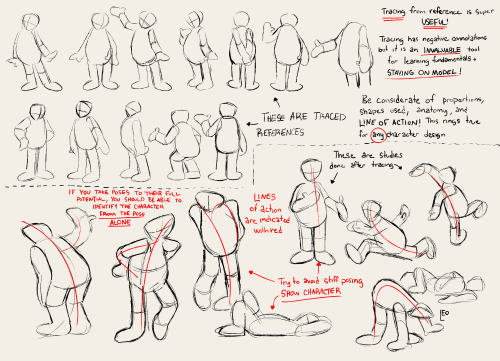
Someone has probably already asked you this but do you have any tips on studying/understanding perspective? I keep trying to find resources to learn but none of them really stick or are actually useful
so I'm hoping that your issue isn't just figuring out the difference between 1-point, 2-point, and 3-point perspective and how it works, because there are tons and tons of resources available for that, and I'm guessing what people tend to get tripped up on is what you're supposed to be doing with your grid.
I'm definitely far from being an expert on understanding perspective, but I'll share some of the things that helped ME finally Get It.


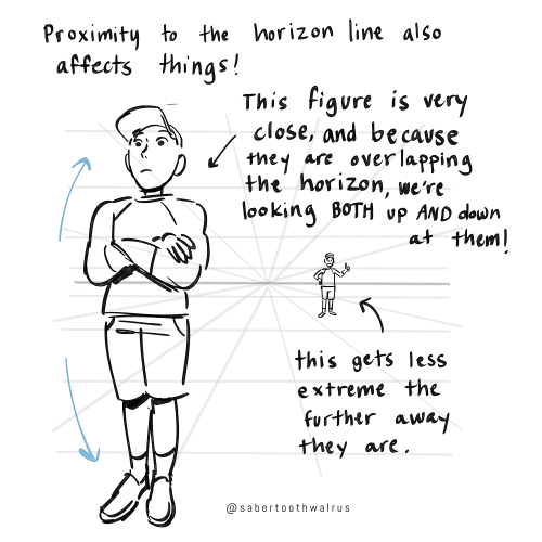
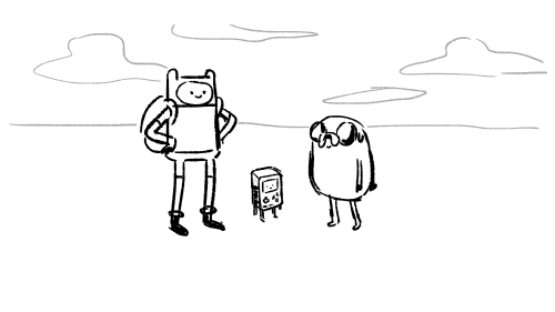
Things like eye level and different camera angles can be a GREAT tool to use when doing a comic or storyboard between multiple characters of different heights!! I actually drew an example of this exact thing for a friend about a month ago (I used adventure time characters bc they're easy to draw and have a good height variety):
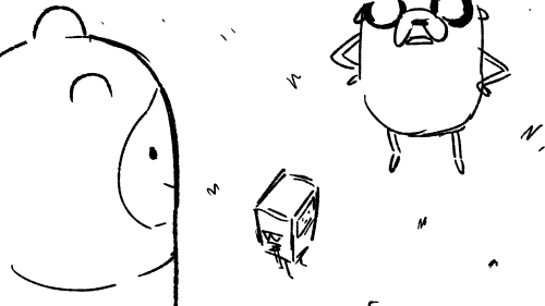


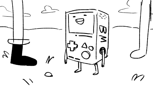
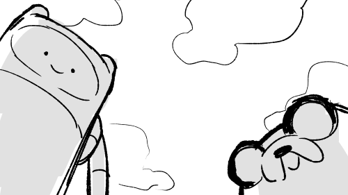
You can use camera angles like this to add variety to your shots, and even use it to help convey something emotional (using a down-shot on a character to show that they FEEL small, use an up-shot on a character to make them look more intimidating, etc etc)
hope this helps!
Apparently a lot of people get dialogue punctuation wrong despite having an otherwise solid grasp of grammar, possibly because they’re used to writing essays rather than prose. I don’t wanna be the asshole who complains about writing errors and then doesn’t offer to help, so here are the basics summarized as simply as I could manage on my phone (“dialogue tag” just refers to phrases like “he said,” “she whispered,” “they asked”):
“For most dialogue, use a comma after the sentence and don’t capitalize the next word after the quotation mark,” she said.
“But what if you’re using a question mark rather than a period?” they asked.
“When using a dialogue tag, you never capitalize the word after the quotation mark unless it’s a proper noun!” she snapped.
“When breaking up a single sentence with a dialogue tag,” she said, “use commas.”
“This is a single sentence,” she said. “Now, this is a second stand-alone sentence, so there’s no comma after ‘she said.’”
“There’s no dialogue tag after this sentence, so end it with a period rather than a comma.” She frowned, suddenly concerned that the entire post was as unasked for as it was sanctimonious.
was watching one of yr speed-paints and im so confused on how yr chopstick pen blends colours?????? i’ve been using the brush for a whileeeee and it does not blend the same beautiful way do you use any custom settings?
that's because it doesn't blend!!
my favourite activity is picking a random spot on the colour wheel that's close to the colour i'm trying to render and just praying it looks good for either lighting or shading. i also take advantage of the brush's slight transparency to create the blended look (i have the brush set to around 70% opacity) AND i also colourpick in the area where two colours overlap and go back over it with the brush so it looks smoother
a visual will probably help explain ,,
little doodle of darrell as a treat C: i also make the brush itself way bigger when it's time to render and take advantage of having opacity by pressure turned on! that way it's easier to cover more space at once and the low opacity helps blend better
i hope this makes sense i realize i have a very odd way of doing these things and i've never really taken a step back to actually analyze my process before


brush settings for your purposes (whatever those may be) C:


![[Image ID: A series of digitally drawn diagrams of hands from different angles. Most of them have three sections of the palms highlighted in different colors, text beside them stating, "3 parts of palm; helps with perspective." There are a couple more, outlining the back of the palms in purple to show the shape. Text there reads, "Back is kind of a rectangle? But I tend to angle according to back of the wrist." Finally, there is a small doodle of my sona frowning & shrugging, saying, "Maybe unhelpful, sorry." End ID.]](https://64.media.tumblr.com/6ed5f4d1ba98657439ec6c89cf95aadb/16b19f760e1b478a-0b/s500x750/602f050bd045ca9300b138716ec059660808ad57.png)


I was asked by a friend yesterday if I could offer basic tips about comic paneling. As it turns out, I have a lot to say on the matter! I tried breaking down the art of paneling using the principles of art and design, and I hope it helps you out!
EDIT: uh uh there are a lot of people reblogging this, so i figure i may as well append this now while i can lol
This whole thing was very much cranked out in a few hours so I had a visual to talk about with a friend! If this gives you a base understanding of paneling, that's awesome! Continue to pull in studies from the comics you see and what other artists do well and don't do well! You can tell paneling is doing well when the action is flowing around in its intended reading format.
Here's the link to the globalcomix article from which I pulled the images about panel staggering! Someone sent in a reblog that it wasn't totally clear that the 7th slide mostly covers what NOT to do in regards to staggering, and that is my mistake!
I saw in a tag that someone was surprised I used MamaYuyu too, and I don't blame them lol. If I had given myself more than a couple hours maybe I would have added something else on, I just really admire MamaYuyu's paneling personally.
uh uh, final append: I am by no means a renowned master of paneling, so if you find anything off base here, by all means, counter it with your own knowledge and ways you can build upon from here! Art is always a sum knowledge of everything we find. 💪
how do you hair .... how do uou draw hair i love how you draw hair
to be completely honest with you I don’t really have a lot of ground rules for how I draw hair—not ones I’m consciously aware of, anyway? Usually I just do whatever feels right depending on the character HOW EVER I do have a few patterns especially when drawing wavy hair or straight hair which curls at the end?
examples of this include


a common rule that I find myself following with all of these is that balance between round and sharp edges, and really big dramatic curls at the ends of the hair.

Lazy diagram I made in 2 minutes demonstrating this

for curly hair (like the giant fucking manes that Gaea and Aster have), I kinda just draw twisty lines until I like the shape, and then go in and add loose curls and layers and stuff.
I still keep that sharp edge at the top of the head though. Really though, only the characters with super long, Heavy hair have that dramatic sharp point. the characters with shorter or fluffier hair generally still have the same swooping motion paired with sharp corners however they lose the dramatic hairline lol


I think that’s all! Funnily enough, I’ve never really thought about my process before this question? So I kind of had to walk through my own steps and figure out what I do. Honestly, every time is a little different just because all my characters are their own people and all have their own style, if that makes sense? For example, Iris, Aeolus, Freyja and Psyche aren’t shown here because they have completely different rules for their hair lol. (Iris’ hair is literal clouds, Aeolus has locs while none of my other characters do, which I will be fixing that soon btw because I love drawing locs, Freyja’s hair is fire and Psyche’s is fog)
so yeah lol I just get prophetic visions from my characters about how to draw their hair and I just listen


When inventing a fantasy religion a lot of people a) make the mistake of assuming that everyone in fantasy world would worship the same gods and b) assume that polytheistic religions see all of their gods as morally good
![Devotion [Part 1/2] [Please Don't Tag As Ship :)]](https://64.media.tumblr.com/83de38034685d0fa8b096f33e346ec3e/e35bc1666be06c6d-06/s500x750/707dab29825d18cf9652cb9fc20a40ff5eb4e949.png)
Devotion [Part 1/2] [Please don't tag as ship :)]


Do you have any tips to give when it comes to designing characters? Especially regarding clothing?
oh my goodness okay so… first of all, keep in mind your character’s setting, personality, their culture, et cetera.
Is the area they live in warm or cold? Do they prefer to be warm or cold? Are they insecure about their body or do they just prefer to dress more modestly? Are they willing to show off some skin?
do they like tight, thick clothing or do they hate feeling restricted? Do they want stiffness or do they want to feel the wind blow through their sleeves and pants? Keep in mind your characters abilities/hobbies/job, et cetera! If they do a lot of things that require agility and mobility, make sure they don’t wear anything that could restrict their movements. They need to be able to move quick and freely.
finally, shape language! Do you want your character to feel stiff or loose? Soft or rigid? Somewhere in the middle? Do you want your character to feel strong? Shy? Gloomy? Approachable?
For stronger, firm characters, I recommend angular, boxy clothing. Padded shoulders and straight slacks and skirts are good for portraying this! For approachable, kind characters, loose fabric that is light and flows with the breeze is good, and long, heavier fabrics are good for shy or gloomy characters. Here’s cosmic as an example and then a few other characters!


Note how Saturn’s coat takes up a lot of space, makes their shoulders seem squared as if they’re holding their head higher than the others. It makes them seem firm and bold, and confident! They also stand out more because of the contrast of the cooler blue hues in their arms(legs?) against the warmer, beige tones in their coat and the warm brown in their hair.
Seraph’s clothes are loose and lighter, don’t take up as much space as Saturn’s—however some parts still do! His wings, halos and his sleeves, for example, are extremely long! This is because while he is not as bold and loud, as strong and confident as Saturn, he still carries himself with a lot of comfortability and pride. His design also is more eye-catching because of the stark contrast between the dark purple of his belt, the white in his toga and the browns in his skin and hair!
Aster, meanwhile, is generally much smaller than the other 2 and gets drowned out a little bit by the weight of her hair and clothes. Her skirt also pools around her feet, tethering her to the ground almost! Shes got much softer edges than the others 2 and takes up as little space as possible—her clothes are also much darker and muted compared to the others 2—also, all her clothes are much heavier and weighed down, they’re very droopy which portrays a much more gloomy vibe.
*edit, playing into the temperature thing; Tycho is super cold! It’s always snowing there. Saturn is cold-blooded so they have to dress warmer, whilst Seraph is somewhat of a walking space heater. Aster might not look too dressed for winter but her skirt is removable and doubles as a cloak! She has pants underneath. :]
other examples include!!

Misery from Ruby Gloom! Misery is a very anxious and melancholy character, and she’s very hesitant to do anything out of fear of causing problems. Her clothing design reflects this! She’s much darker compared to the rest of the cast and almost all of herself save for her face is hidden. Her colours are also much more muted and dull, and there isn’t as much contrast between them as there is with characters like Ruby or Frank and Len. All of her clothes are long and hang down and, much like Aster, tether her to the ground. She also takes up a little less space than almost the entire rest of the cast.

Another example is Hobie Brown/Spiderpunk! His clothing is all very angular and dramatic, with a lot of rigid lines and sharp edges, as well as stiff, heavy fabrics like leather and denim. Hobie is a very unapologetically confident character! I won’t go into too much detail because I’m quite sure everybody knows who he is, but he’s extremely nonconformist and a complete anarchist, and is quite proud about it. Even though most of his clothes are in darker, muted hues, his design is very loud and hard to ignore. Also the classic blue and red of almost every Spider-Man design is just as smart, as they’re (almost) completely contrasting colours, so they still catch your eye.

Lastly is Darryl from TGaMM! While he’s a little shit sometimes, he’s ultimately still a good friend and brother to Molly, and is generally just having fun without any malice in mind. He’s very laid back and approachable, but not as excitable as Molly! (Important; Molly's design is much more rigid and high-contrast compared to Darryl’s! Darryl’s colour palette is more muted and harmonious while Molly’s is a little more all over the place, though it’s still not an eyesore. You feel me?)
I hope this helped! If you have any more questions that I didn’t answer or if you need me to elaborate on something feel completely free to let me know!!
I was wondering how achieve such a wonderful textured finish on your pieces? They are wonderful and I love their resemblance to aged photographs and the speckles of colors in the backgrounds. Your art is mesmerizing :)
you can see some of the texture brush sets i use in my #info_asks tag but i have some more (procreate) tips aside from just brushes
also hi i made this whole thing and then stupidly hit ctrl z to erase ONE word and i lost the entire bottom half of the post and all my image descriptions so fuck you tumblr i had to make this twice
to get a faded photo or old digital screen look, consider duplicating the canvas (once all the layers are merged) and using a gaussian blur tool on the new duplicated layer. then set that to low opacity to add a misty sort of look. looks nice in combination with some chromatic abberation and a small bloom effect. then a subtle noise filter on top:

for faded print effects, it's really worthwhile to learn how to use layer masks. you can use a layer mask to non-destructively 'weather' blocks of colour or lineart, without erasing the layer itself. the weathered ink/block print effect here was made using layer masks which means that if i just hide the mask, the lineart becomes solid black again and easy to alter or colour in:

for old paper effects you can just set a paper texture on multiply over the art sure, but you can also combine it with the blur & bloom thing, a really subtle drop shadow and canvas tilt, and highlights to make it look like an aged photograph of a card. this originally had a transparent bg but i'll post it here with a white bg so that the drop shadow is more obvious. the scuffed edges of the card (left) were hand drawn, simple white stucco brush. the bigger patch of scuffed ink (top right) was a texture stamp.

for block print looks you can move the colour layer out of alignment by a few pixels - but only after you're absolutely sure you're done with it, otherwise you'll get something like this -

i forgot to erase out her eye before i moved the red layer so now her eye defeats the 'look' of a misaligned print. the black lineart and red layer were also given the same layer mask treatment as described above to make them look faded or like the ink didn't stick down right to the paper
you can do this with multiple colour layers too. if the colour layers are separated and set to multiply (as in this cmyk example), it'll leave halos and edges around each shape which mimic old comic book print

just to show what you can do WITHOUT any special brushes, here's a piece of one of my mez tarot cards from before i got any extra brushsets at all. for this one, i added a green tint over everything to mimic a sun-bleached or faded print (my actual goal wasn't 'medieval illustration' but actually 'trading card from the 60s that got left on someone's windowsill for decades'). the background texture is the procreate noise brush. the texture under the green lion drawing is the procreate concrete brush (to make it look painted onto a wall). the lettering and lineart is procreate's 6B pencil. but to properly aim for The Look of it being a printed physical object, i also used a perspective blur so that the edges are out of focus, and metallic gold highlights which don't match the lighting of the actual illustration and appear to be catching some other external light. that texture was made from the procreate noise brush

it's pretty simple compared to my later stuff but i still really like the effect
in terms of colours, you need to keep them unified so that they all appear to be acting under the same external light source, like if someone is holding up a torch to a painting then the painting colours will be glazed with firelight even if there's no painted fire. a really easy way to do this is to slap a multiply layer over everything in one shade - grey-yellow for a weathered paper look, or greenish blue for sunbleached photos. this unifies all the colours of the drawing. or you can apply a gradient map at a low opacity so that there's only a subtle change. or just do it by hand - if you want everything to be slightly tinted yellow, just pick the colours you normally would, but move the colour wheel towards yellow to get a yellowfied version of the base colour. easy
it's really important to consider how fading and weathering can affect printed colour. white paper yellows, black fades. you will rarely see pure black or pure white. which means you can use pure black or pure white to add external effects like the white scuff marks on the hierophant card. if the whole drawing is yellowed from age but there's some white somewhere, it's an easy shorthand to show that the scuff mark or whatever was not originally part of the drawing (great way to add some nasty stains lol)
Show, don’t tell
"Show, don’t tell" means letting readers experience a story through actions, senses, and dialogue instead of outright explaining things. Here are some practical tips to achieve that:
1. Use Sensory Details
Tell: "The room was cold."
Show: "Her breath puffed in faint clouds, and she shivered as frost clung to the edges of the window."
Tell: "He was scared."
Show: "His hands trembled, and his heart thudded so loudly he was sure they could hear it too."
2. Focus on Actions
Tell: "She was angry."
Show: "She slammed the mug onto the counter, coffee sloshing over the rim as her jaw clenched."
Tell: "He was exhausted."
Show: "He stumbled through the door, collapsing onto the couch without even bothering to remove his shoes."
3. Use Dialogue
What characters say and how they say it can reveal their emotions, intentions, or traits.
Tell: "She was worried about the storm."
Show: "Do you think it'll reach us?" she asked, her voice tight, her fingers twisting the hem of her shirt.
4. Show Internal Conflict Through Thoughts or Reactions
Tell: "He was jealous of his friend."
Show: "As his friend held up the trophy, he forced a smile, swallowing the bitter lump rising in his throat."
5. Describe the Environment to Reflect Mood
Use the setting to mirror or hint at emotions or themes.
Tell: "The town was eerie."
Show: "Empty streets stretched into the mist, and the only sound was the faint creak of a weathered sign swinging in the wind."
6. Let Readers Infer Through Context
Give enough clues for the reader to piece things together without spelling it out.
Tell: "The man was a thief."
Show: "He moved through the crowd, fingers brushing pockets, his hand darting away with a glint of gold."
7. Use Subtext in Interactions
What’s left unsaid can reveal as much as what’s spoken.
Tell: "They were uncomfortable around each other."
Show: "He avoided her eyes, pretending to study the painting on the wall. She smoothed her dress for the third time, her fingers fumbling with the hem."
8. Compare to Relatable Experiences
Use metaphors, similes, or comparisons to make an emotion or situation vivid.
Tell: "The mountain was huge."
Show: "The mountain loomed above them, its peak disappearing into the clouds, as if it pierced the heavens."
Practice Example:
Tell: "The village had been destroyed by the fire."
Show: "Charred beams jutted from the rubble like broken ribs, the acrid smell of ash lingering in the air. A child's shoe lay half-buried in the soot, its leather curled from the heat."
any shading tips?
AH I LOVE SHADING AND RENDERING let me see what i can dig up from my brain for you
i say....... single colour blend mode layer is a good starting point for shading but i'd also manually pick colours to make the shadow more dynamic, if that makes sense..


left has a yellow-y hard light layer as its only shading, and right has the hard light layer alongside some colours i added myself
also, i like to mess with the saturation and hue when i add the extra colours.. it adds depth (life??) to the shadows that you wouldnt get with a flat colour


IN ADDITION TO THIS desaturating your colours makes them look lighter, and hightening the saturation makes them seem darker! i play with this a lot it's fun
not shown here is also using completely different colours than the one you're shading, like green/teal for blue, or red for purple! this is especially helpful when shading grays and whites
basically get funky with your colours and try shit until you find a formula that works for you!!!! this is just what i do and im a self-taught nerd so
So I thought this was commonly known internet navigation (but apparently it might just be those of us who have been using the internet since the 90’s who still know it). Or so it seems based on… a grumpy comment I got.
When you see an arrow like this:

It means you click it to expand out a hidden section.

It’s an accordion section/menu! It’s useful in web design to hide information that may be overwhelming under specific headers so people can only see what they need.
Here I’m using it for people who need the content warnings to be able to check, but for those who don’t need them and don’t want to be spoiled to just move right past without accidentally reading anything.
It’s still the user’s responsibility to click the arrow and read things as they need! But it is all warned. (And, yes, the all encompassing issues are already a tag on the fic, I’m just providing additonal warnings per chapter.)


hot artists don't gatekeep
I've been resource gathering for YEARS so now I am going to share my dragons hoard
Floorplanner. Design and furnish a house for you to use for having a consistent background in your comic or anything! Free, you need an account, easy to use, and you can save multiple houses.
Comparing Heights. Input the heights of characters to see what the different is between them. Great for keeping consistency. Free.
Magma. Draw online with friends in real time. Great for practice or hanging out. Free, paid plan available, account preferred.
Smithsonian Open Access. Loads of free images. Free.
SketchDaily. Lots of pose references, massive library, is set on a timer so you can practice quick figure drawing. Free.
SculptGL. A sculpting tool which I am yet to master, but you should be able to make whatever 3d object you like with it. free.
Pexels. Free stock images. And the search engine is actually pretty good at pulling up what you want.
Figurosity. Great pose references, diverse body types, lots of "how to draw" videos directly on the site, the models are 3d and you can rotate the angle, but you can't make custom poses or edit body proportions. Free, account option, paid plans available.
Line of Action. More drawing references, this one also has a focus on expressions, hands/feet, animals, landscapes. Free.
Animal Photo. You pose a 3d skull model and select an animal species, and they give you a bunch of photo references for that animal at that angle. Super handy. Free.
Height Weight Chart. You ever see an OC listed as having a certain weight but then they look Wildly different than the number suggests? Well here's a site to avoid that! It shows real people at different weights and heights to give you a better idea of what these abstract numbers all look like. Free to use.


10 Non-Lethal Injuries to Add Pain to Your Writing
If you need a simple way to make your characters feel pain, here are some ideas:
1. Sprained Ankle
A common injury that can severely limit mobility. This is useful because your characters will have to experience a mild struggle and adapt their plans to their new lack of mobiliy. Perfect to add tension to a chase scene.
2. Rib Contusion
A painful bruise on the ribs can make breathing difficult, helping you sneak in those ragged wheezes during a fight scene. Could also be used for something sport-related! It's impactful enough to leave a lingering pain but not enough to hinder their overall movement.
3. Concussions
This common brain injury can lead to confusion, dizziness, and mood swings, affecting a character’s judgment heavily. It can also cause mild amnesia.
I enjoy using concussions when you need another character to subtly take over the fight/scene, it's an easy way to switch POVs. You could also use it if you need a 'cute' recovery moment with A and B.
4. Fractured Finger
A broken finger can complicate tasks that require fine motor skills. This would be perfect for characters like artists, writers, etc. Or, a fighter who brushes it off as nothing till they try to throw a punch and are hit with pain.
5. Road Rash
Road rash is an abrasion caused by friction. Aka scraping skin. The raw, painful sting resulting from a fall can be a quick but effective way to add pain to your writing. Tip: it's great if you need a mild injury for a child.
6. Shoulder Dislocation
This injury can be excruciating and often leads to an inability to use one arm, forcing characters to confront their limitations while adding urgency to their situation. Good for torture scenes.
7. Deep Laceration
A deep laceration is a cut that requires stitches. As someone who got stitches as a kid, they really aren't that bad! A 2-3 inch wound (in length) provides just enough pain and blood to add that dramatic flair to your writing while not severely deterring your character.
This is also a great wound to look back on since it often scars. Note: the deeper and wider the cut the worse your character's condition. Don't give them a 5 inch deep gash and call that mild.
8. Burns
Whether from fire, chemicals, or hot surfaces, burns can cause intense suffering and lingering trauma. Like the previous injury, the lasting physical and emotional trauma of a burn is a great wound for characters to look back on.
If you want to explore writing burns, read here.
9. Pulled Muscle
This can create ongoing pain and restrict movement, offering a window to force your character to lean on another. Note: I personally use muscle related injuries when I want to focus more on the pain and sprains to focus on a lack of mobility.
10. Tendonitis
Inflammation of a tendon can cause chronic pain and limit a character's ability to perform tasks they usually take for granted. When exploring tendonitis make sure you research well as this can easily turn into a more severe injury.
This is a quick, brief list of ideas to provide writers inspiration. Since it is a shorter blog, I have not covered the injuries in detail. This is inspiration, not a thorough guide. Happy writing! :)
Looking For More Writing Tips And Tricks?
Check out the rest of Quillology with Haya; a blog dedicated to writing and publishing tips for authors!
Instagram Tiktok

How do you legs
Curves vs. straights baby !

I try to always think of the flow of the legs in relation to the overall posture, so getting those curves and straights into play is really handy.

I've added an extra colored line here (the green one) that I tend to do with poses that are leaning heavily, so the line of action becomes more clear and less broken up by the hip. This works best for standing poses (and is obviously not anatomically correct, it's just my preferred way of drawing bodies).
In sitting poses, the straights help to emphasize contact with the ground.

Dear downydig,
Any secret knowledge on how to do fluid and dynamic poses? (Btw, I love ur art!! So comfy and cozy!!!)
Sincerely, Paper-Starz
Hello hello! I have some advice! I did a thing on lines of action and the benefits of tracing in learning models a LONG time ago… the advice still holds up! Use shapes like ‘s’ curves, ‘c’ curves, and even sharper ‘U’s to give a fun fluid motion! Limbs and spine are the main help here, but the head sometimes comes into play ✌️
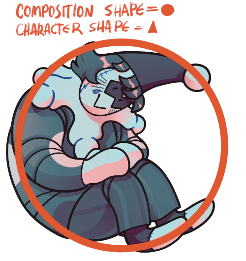
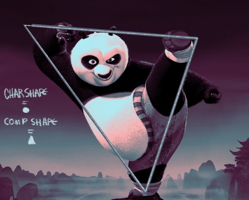
I have a little more to add, however! One of these pictures is my oc and the other is a king fu panda character but it’s still useful! When creating a pose, you can also use silhouette! Bonus points if the shape of the silhouette is different than the shapes that compose the character (in a way that matches the personality of course!)
this showed up in my FB memories, the lightning bolt trick! I don't sketch out the lightning bolt much nowadays but it's still super helpful when I need to lay out tricky arms and leg poses. And I still apply the logic of it, especially with how I draw arms :' ) Biggest thing it helps with is shape breakdown and visualization, we gotta use whatever works to break down shapes into simpler concepts for our brains 👏💓