Sometimes You Need Dialogue Tags And Don't Want To Use The Same Four
sometimes you need dialogue tags and don't want to use the same four


More Posts from Ardouradvice and Others
When inventing a fantasy religion a lot of people a) make the mistake of assuming that everyone in fantasy world would worship the same gods and b) assume that polytheistic religions see all of their gods as morally good
HOW TO WRITE A CHARACTER WHO IS IN PAIN
first thing you might want to consider: is the pain mental or physical?
if it’s physical, what type of pain is it causing? — sharp pain, white-hot pain, acute pain, dull ache, throbbing pain, chronic pain, neuropathic pain (typically caused by nerve damage), etc
if it’s mental, what is the reason your character is in pain? — grief, heartbreak, betrayal, anger, hopelessness, fear and anxiety, etc
because your character will react differently to different types of pain
PHYSICAL PAIN
sharp and white-hot pain may cause a character to grit their teeth, scream, moan, twist their body. their skin may appear pale, eyes red-rimmed and sunken with layers of sweat covering their forehead. they may have tears in their eyes (and the tears may feel hot), but they don’t necessarily have to always be crying.
acute pain may be similar to sharp and white-hot pain; acute pain is sudden and urgent and often comes without a warning, so your character may experience a hitched breathing where they suddenly stop what they’re doing and clench their hand at the spot where it hurts with widened eyes and open mouth (like they’re gasping for air).
dull ache and throbbing pain can result in your character wanting to lay down and close their eyes. if it’s a headache, they may ask for the lights to be turned off and they may be less responsive, in the sense that they’d rather not engage in any activity or conversation and they’d rather be left alone. they may make a soft whimper from their throat from time to time, depends on their personality (if they don’t mind others seeing their discomfort, they may whimper. but if your character doesn’t like anyone seeing them in a not-so-strong state, chances are they won’t make any sound, they might even pretend like they’re fine by continuing with their normal routine, and they may or may not end up throwing up or fainting).
if your character experience chronic pain, their pain will not go away (unlike any other illnesses or injuries where the pain stops after the person is healed) so they can feel all these types of sharp pain shooting through their body. there can also be soreness and stiffness around some specific spots, and it will affect their life. so your character will be lucky if they have caretakers in their life. but are they stubborn? do they accept help from others or do they like to pretend like they’re fine in front of everybody until their body can’t take it anymore and so they can no longer pretend?
neuropathic pain or nerve pain will have your character feeling these senses of burning, shooting and stabbing sensation, and the pain can come very suddenly and without any warning — think of it as an electric shock that causes through your character’s body all of a sudden. your character may yelp or gasp in shock, how they react may vary depends on the severity of the pain and how long it lasts.
EMOTIONAL PAIN
grief can make your character shut themself off from their friends and the world in general. or they can also lash out at anyone who tries to comfort them. (five states of grief: denial, anger, bargaining, depression and eventual acceptance.)
heartbreak — your character might want to lock themself in a room, anywhere where they are unseen. or they may want to pretend that everything’s fine, that they’re not hurt. until they break down.
betrayal can leave a character with confusion, the feelings of ‘what went wrong?’, so it’s understandable if your character blames themself at first, that maybe it’s their fault because they’ve somehow done something wrong somewhere that caused the other character to betray them. what comes after confusion may be anger. your character can be angry at the person who betrayed them and at themself, after they think they’ve done something wrong that resulted in them being betrayed, they may also be angry at themself next for ‘falling’ for the lies and for ‘being fooled’. so yes, betrayal can leave your character with the hatred that’s directed towards the character who betrayed them and themself. whether or not your character can ‘move on and forgive’ is up to you.
there are several ways a character can react to anger; they can simply lash out, break things, scream and yell, or they can also go complete silent. no shouting, no thrashing the place. they can sit alone in silence and they may cry. anger does make people cry. it mostly won’t be anything like ‘ugly sobbing’ but your character’s eyes can be bloodshot, red-rimmed and there will be tears, only that there won’t be any sobbing in most cases.
hopelessness can be a very valid reason for it, if you want your character to do something reckless or stupid. most people will do anything if they’re desperate enough. so if you want your character to run into a burning building, jump in front of a bullet, or confess their love to their archenemy in front of all their friends, hopelessness is always a valid reason. there’s no ‘out of character’ if they are hopeless and are desperate enough.
fear and anxiety. your character may be trembling, their hands may be shaky. they may lose their appetite. they may be sweaty and/or bouncing their feet. they may have a panic attack if it’s severe enough.
and I think that’s it for now! feel free to add anything I may have forgotten to mention here!
pssssst hey. hey. free and expansive database of folk and fairy tales. you can thank me later
Someone has probably already asked you this but do you have any tips on studying/understanding perspective? I keep trying to find resources to learn but none of them really stick or are actually useful
so I'm hoping that your issue isn't just figuring out the difference between 1-point, 2-point, and 3-point perspective and how it works, because there are tons and tons of resources available for that, and I'm guessing what people tend to get tripped up on is what you're supposed to be doing with your grid.
I'm definitely far from being an expert on understanding perspective, but I'll share some of the things that helped ME finally Get It.


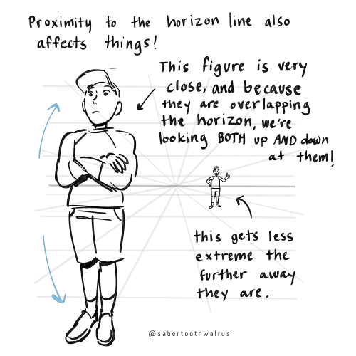
Things like eye level and different camera angles can be a GREAT tool to use when doing a comic or storyboard between multiple characters of different heights!! I actually drew an example of this exact thing for a friend about a month ago (I used adventure time characters bc they're easy to draw and have a good height variety):
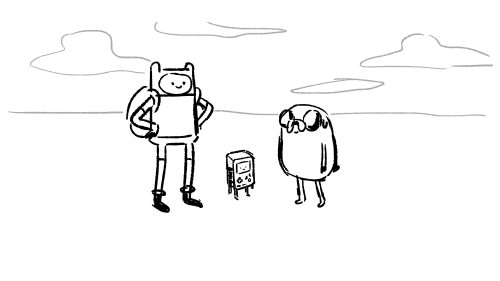
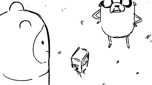


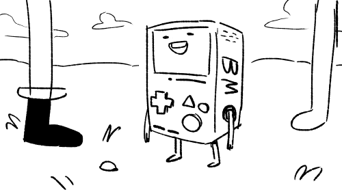
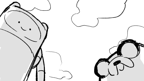
You can use camera angles like this to add variety to your shots, and even use it to help convey something emotional (using a down-shot on a character to show that they FEEL small, use an up-shot on a character to make them look more intimidating, etc etc)
hope this helps!
Hi pigs "whale yuri Wednesday" with wings!!! I think the colors in your art are very cute nd i was wondering if you have a method with picking them? I struggle a lot with color picking when i dont have smth to work off of!
Also not an ask but you should post more about your original art/reblog it!! ocs too!! :]
well!! i don't have a specific method most of the time I'm eyeballing all of that!! but i can give some general tips on how i personally pick colours...
also: thank you 🫶🫶 ... i do not make art very often so most of the time i feel like there is nothing to post about!! but i will try to reblog my own art more often!! i have been working a lot on one oc of mine so perhaps you will see more of it :]
- i tend to first put all the colours side by side to get a sense of how they'll all look together!!
- usually i start with a very light or very dark colour that i like, and build off of that.


- after i choose a color to work off of, i tend to pick another colour that's similar to the first colour. (black and white can go well with basically every colour if you're stuck!)
i personally try to keep the colours distinct enough that you can tell it's another colour. this isn't totally necessary, it's mostly because i use a lineless style and my shapes won't be distinguishable if i don't make it clear which colour is which. for example with fhese two images - it's easier to tell between the colours on the right than the colours on the left.


specific processes here:
in the top left corner here, i chose the black, then the dark blue/dark purple, then the purple, then the light purple. they're all in the same area of the colour wheel but each one gradually progresses in brightness and moves into another area of the colour wheel.

same with the top right corner - i started with the white and chose a shade of orange that was easy to see against it. then a similar shade of yellow to pair with the orange, and then i wanted a highlight colour to stand out. since the general pattern of this colour set is bright/warm colours, we can choose another bright or warm colour that's different in brightness or shade - in this case i chose a bright green, but a bright red would have also gone nicely with this.
the bottom left and right is mostly the same as above, but finding a colour palette like the bottom right can be trickier. i started with a combination of white, cyan, and purple but thought that it looked a bit boring. so i picked a colour that wasn't blue or purple but a bright(er) red so that it stood out. could have also used bright orange/yellow/pink instead, but i think the red gives it an interesting contrast. i like to think that it's all about contrast
i tend to make colour palettes at random just for fun, so i think that practice or just putting colours together to see what looks good can also help!! some more examples below of just. colour palettes or colours that work well together

and yeah! to be honest i don't really know what i am doing but i like messing around with groups of colours. do what you want, lay down some colours that you like and most importantly have fun 👍👍👍
SO! You've seen these little things I do sometimes and you want to know the process!


It's genuinely super simple, so here goes! Apologies by the way if anything is unclear or glossed over. A lot of this is personal taste and such so I hope this can be a nice boost to create something!

RESOURCES AND THINGS TO KNOW!
To preface this little guide already assumes you have basic knowledge of color distribution, lineless art, or breaking up art into proper layers for later processing! I am also assuming that your art program has access to scatter brushes and tiling textures. Personally I use Clip Studio Paint, but this can work on other apps. Anyways, here are some good sites for this:
EZGIF - Free, easy gif maker for assembling any kind of gif*! It also has stuff like converting those damn WEBP's back into png.
*PLEASE KNOW THAT YOU CANNOT MAKE GIFS THAT ARE PARTIALLY TRANSPARENT. YOU MUST USE A SOLID COLOR UNDER ANY PART THAT IS OVER BARE CANVAS
Transparent Textures - Free to use source for HQ transparent textures that tile! Amazing for finding a paper texture for these if you commit to the paper doll look. Best results for textures that are in white or black!
So! You have a finished, prepared piece that you want to glitterfy. Well I'm not covering that right now so you can scroll down to That part if you came just for the glitter. This next section is for...
PREPARING THE PAPER DOLL
To start, your piece should already be separated into respective layers in any order you'd like! We're about to use a ton of clipping masks so Make sure you know your program before starting! So, as my example we have my oc Roy, resized to around... 1500x1500 or the nearest equivalent Smaller is better because it brings out the texture! He looks a little ah...Flat, though right now?

I'm using this guy for a couple different reasons! Those being:
Roy has translucent bodyparts! Just so you will know what to do with characters who are translucent! I'll get to this in a moment so sit tight
He has a clear, defined, and distinct palette that is easy to pick a color to slap the glitter on! This is important because I personally find balance to be the most appealing part of the finished art.
He also just has a lot of doohickeys on his design.
This is where you need your transparent texture! You can use any kind of texture and I encourage experimentation and such, but I personally use a simple paper texture. What we are going to do is go through and clip our imported and tiled texture to each applicable layer! (Make sure to just Copy and Paste the layer you do NOT need to repeatedly go through this menu...)

And... When you are done, you should have something like this:

"But why don't I just clip the texture to the entire piece through a folder? Why go through the hassle of clipping to each individual layer?"
Well that's because of the next step, where we will be adding the shadows. If we don't clip each individual layer, your shadows will look like this example on the left which sort of just ruins the 3D effect and kinda just looks icky, as opposed to this, which is nicer and smoother.


Now I'm no lighting wiz! In fact I'm rather mediocre at best but some general tips for adding the shadows:
Try to keep your shadows going all in one direction mostly! It gives the effect of one light source and generally just looks better than if you shaded around ALL edges everywhere.
Try to only shade where there are parts overlapping that need the dimension! Overdoing it can make the piece look odd. It's especially helpful to separate any details like different shades of hair, layers of hair, etc so that you can put as much volume as you want.
Once the shadows are all added in you should have something that looks like this:

Which looks good! Now I'd sometimes stop here if I can't pinpoint how I'd like the glitter to sit or if I think the piece just doesn't need it, but we're moving on to the big important steps!
ADDING GLITTER
This part is entirely up to your taste! But I'll describe how I do my glitter stuff. Firstly I start out by identifying which color I want to pop out. For Roy here I chose the red parts! For your character it may be different. Experimentation is key!
This is also, however where you need that scatter brush I mentioned earlier. Personally I just use the default CSP spray brush, but again go wild!

Make a folder above your piece, set its blending mode to glow dodge (or add, or add glow depending on what options you have), and create three layers inside of this folder. Setting the folder to clip is optional right now but will be needed later.

Then, fill each glitter layer with your choice of particle in whatever color looks good! Yes, you can do gradients and other stuff on the particles too! World's your oyster.

^ Unclipped example of a glitter layer.
Glitter tips for the early 2000's webcore enthusiast:
Use different strokes and patterns for the glitter distribution! This helps it animate better by moving around. For example this time I went diagonally for the first, horizontally for the second, and then in loose circles for the third. Particle density and stuff is also completely up to you.
Use a color that would pop against the intended area! For Roy I used an orange-ish yellow since it compliments both blue and red.
So now we have the layers! This is where clipping is our best friend once again! You're just going to go in and clip the glitter to whatever layers you want it on. Entire folder, not just one of the layers!

Once that's all done, go through and toggle the respective glitter layer for the frame, saving individual copies when done. You should end up with 3 identical images with different glitter distribution.
"BUT WAIT! JONES, THE TRANSLUCENCY!!" I hear you call! Yes, this is where we handle that! If your character is NOT translucent, you can scroll past this section.
Open up your frames all in one canvas, stacked on top of eachother (no jittering or slight displacement! ON TOP of eachother!)

Our layout should look something like this...Note how the translucent parts are rather hard to see, well if you took your frames and put them in EZgif, they'd be gone entirely! That's because you physically cannot have a partially translucent gif due to technology limitations. So an easy little cleanup thing I did was:
1. SELECT THE CANVAS AROUND THE CHARACTER WITH THE MAGIC WAND TOOL. Do not have any expansion settings on or it probably won't look right in the end.

Make sure you do not miss any gaps! I personally missed the gap between the arm, leg, and lanyard and I had to redo this next step...
2. SELECT -> INVERT SELECTION


3. FILL SELECTION WITH THE DESIRED COLOR. IT MUST BE OPAQUE. I personally picked this cloudy gray color.

You can now save individual frames of your character with the fill so that they don't go bald when you move on to the next step! Again, you should have 3 frames.
FINISHING UP
This is nice and easy. Upload your three frames into EZGIF and wait for it to process. It'll look like this if you're in the right place.

Once things have loaded, make sure to change the settings to the following:
FRAME DELAY: 0 (this is how fast the frames move.)
DON'T STACK FRAMES: ENABLED
You can play around with this but I generally leave everything else alone because you don't need it. Just hit the make a gif button and you're all done!

Aaaand that's it! If you've read this far...Firstly thank you for dealing with my rambliness and horrible explanation skills. Secondly, I hope that this can come in handy for anyone interested! Would love to see if anyone puts this to use. n_n
⭐ So you want to learn pixel art? ⭐
🔹 Part 1 of ??? - The Basics!
Edit: Now available in Google Doc format if you don't have a Tumblr account 🥰
Hello, my name is Tofu and I'm a professional pixel artist. I have been supporting myself with freelance pixel art since 2020, when I was let go from my job during the pandemic.


My progress, from 2017 to 2024. IMO the only thing that really matters is time and effort, not some kind of natural talent for art.
This guide will not be comprehensive, as nobody should be expected to read allat. Instead I will lean heavily on my own experience, and share what worked for me, so take everything with a grain of salt. This is a guide, not a tutorial. Cheers!
🔹 Do I need money?
NO!!! Pixel art is one of the most accessible mediums out there.
I still use a mouse because I prefer it to a tablet! You won't be at any disadvantage here if you can't afford the best hardware or software.
Because our canvases are typically very small, you don't need a good PC to run a good brush engine or anything like that.
✨Did you know? One of the most skilled and beloved pixel artists uses MS PAINT! Wow!!
🔹 What software should I use?
Here are some of the most popular programs I see my friends and peers using. Stars show how much I recommend the software for beginners! ⭐
💰 Paid options:
⭐⭐⭐ Aseprite (for PC) - $19.99
This is what I and many other pixel artists use. You may find when applying to jobs that they require some knowledge of Aseprite. Since it has become so popular, companies like that you can swap raw files between artists.
Aseprite is amazingly customizable, with custom skins, scripts and extensions on Itch.io, both free and paid.
If you have ever used any art software before, it has most of the same features and should feel fairly familiar to use. It features a robust animation suite and a tilemap feature, which have saved me thousands of hours of labour in my work. The software is also being updated all the time, and the developers listen to the users. I really recommend Aseprite!
⭐ Photoshop (for PC) - Monthly $$
A decent option for those who already are used to the PS interface. Requires some setup to get it ready for pixel-perfect art, but there are plenty of tutorials for doing so.
Animation is also much more tedious on PS which you may want to consider before investing time!
⭐⭐ ProMotion NG (for PC) - $19.00
An advanced and powerful software which has many features Aseprite does not, including Colour Cycling and animated tiles.
⭐⭐⭐ Pixquare (for iOS) - $7.99 - $19.99 (30% off with code 'tofu'!!)
Probably the best app available for iPad users, in active development, with new features added all the time.

Look! My buddy Jon recommends it highly, and uses it often.
One cool thing about Pixquare is that it takes Aseprite raw files! Many of my friends use it to work on the same project, both in their office and on the go.
⭐ Procreate (for iOS) - $12.99
If you have access to Procreate already, it's a decent option to get used to doing pixel art. It does however require some setup. Artist Pixebo is famously using Procreate, and they have tutorials of their own if you want to learn.
⭐⭐ ReSprite iOS and Android. (free trial, but:) $19.99 premium or $$ monthly
ReSprite is VERY similar in terms of UI to Aseprite, so I can recommend it. They just launched their Android release!
🆓 Free options:
⭐⭐⭐ Libresprite (for PC)
Libresprite is an alternative to Aseprite. It is very, very similar, to the point where documentation for Aseprite will be helpful to Libresprite users.
⭐⭐ Pixilart (for PC and mobile)
A free in-browser app, and also a mobile app! It is tied to the website Pixilart, where artists upload and share their work. A good option for those also looking to get involved in a community.
⭐⭐ Dotpict (for mobile)
Dotpict is similar to Pixilart, with a mobile app tied to a website, but it's a Japanese service. Did you know that in Japanese, pixel art is called 'Dot Art'? Dotpict can be a great way to connect with a different community of pixel artists! They also have prompts and challenges often.
🔹 So I got my software, now what?
◽Nice! Now it's time for the basics of pixel art.
❗ WAIT ❗ Before this section, I want to add a little disclaimer. All of these rules/guidelines can be broken at will, and some 'no-nos' can look amazing when done intentionally.
The pixel-art fundamentals can be exceedingly helpful to new artists, who may feel lost or overwhelmed by choice. But if you feel they restrict you too harshly, don't force yourself! At the end of the day it's your art, and you shouldn't try to contort yourself into what people think a pixel artist 'should be'. What matters is your own artistic expression. 💕👍
◽Phew! With that out of the way...
🔸"The Rules"
There are few hard 'rules' of pixel art, mostly about scaling and exporting. Some of these things will frequently trip up newbies if they aren't aware, and are easy to overlook.
🔹Scaling method
There are a couple ways of scaling your art. The default in most art programs, and the entire internet, is Bi-linear scaling, which usually works out fine for most purposes. But as pixel artists, we need a different method.


Both are scaled up x10. See the difference?
On the left is scaled using Bilinear, and on the right is using Nearest-Neighbor. We love seeing those pixels stay crisp and clean, so we use nearest-neighbor.
(Most pixel-art programs have nearest-neighbor enabled by default! So this may not apply to you, but it's important to know.)
🔹Mixels
Mixels are when there are different (mixed) pixel sizes in the same image.

Here I have scaled up my art- the left is 200%, and the right is 150%. Yuck!
As we can see, the "pixel" sizes end up different. We generally try to scale our work by multiples of 100 - 200%, 300% etc. rather than 150%. At larger scales however, the minute differences in pixel sizes are hardly noticeable!
Mixels are also sometimes seen when an artist scales up their work, then continues drawing on it with a 1 pixel brush.

Many would say that this is not great looking! This type of pixels can be indicative of a beginner artist. But there are plenty of creative pixel artists out there who mixels intentionally, making something modern and cool.
🔹Saving Your Files
We usually save our still images as .PNGs as they don’t create any JPEG artifacts or loss of quality. It's a little hard to see here, but there are some artifacts, and it looks a little blurry. It also makes the art very hard to work with if we are importing a JPEG.

For animations .GIF is good, but be careful of the 256 colour limit. Try to avoid using too many blending mode layers or gradients when working with animations. If you aren’t careful, your animation could flash afterwards, as the .GIF tries to reduce colours wherever it can. It doesn’t look great!

Here's an old piece from 2021 where I experienced .GIF lossiness, because I used gradients and transparency, resulting in way too many colours.
🔹Pixel Art Fundamentals - Techniques and Jargon
❗❗Confused about Jaggies? Anti-Aliasing? Banding? Dithering? THIS THREAD is for you❗❗ << it's a link, click it!!
As far as I'm concerned, this is THE tutorial of all time for understanding pixel art. These are techniques created and named by the community of people who actually put the list together, some of the best pixel artists alive currently. Please read it!!
🔸How To Learn
Okay, so you have your software, and you're all ready to start. But maybe you need some more guidance? Try these tutorials and resources! It can be helpful to work along with a tutorial until you build your confidence up.
⭐⭐ Pixel Logic (A Digital Book) - $10 A very comprehensive visual guide book by a very skilled and established artist in the industry. I own a copy myself.
⭐⭐⭐ StudioMiniBoss - free A collection of visual tutorials, by the artist that worked on Celeste! When starting out, if I got stuck, I would go and scour his tutorials and see how he did it.
⭐ Lospec Tutorials - free A very large collection of various tutorials from all over the internet. There is a lot to sift through here if you have the time.
⭐⭐⭐ Cyangmou's Tutorials - free (tipping optional) Cyangmou is one of the most respected and accomplished modern pixel artists, and he has amassed a HUGE collection of free and incredibly well-educated visual tutorials. He also hosts an educational stream every week on Twitch called 'pixelart for beginners'.
⭐⭐⭐ Youtube Tutorials - free There are hundreds, if not thousands of tutorials on YouTube, but it can be tricky to find the good ones. My personal recommendations are MortMort, Brandon, and AdamCYounis- these guys really know what they're talking about!
🔸 How to choose a canvas size
When looking at pixel art turorials, we may see people suggest things like 16x16, 32x32 and 64x64. These are standard sizes for pixel art games with tiles. However, if you're just making a drawing, you don't necessarily need to use a standard canvas size like that.
What I like to think about when choosing a canvas size for my illustrations is 'what features do I think it is important to represent?' And make my canvas as small as possible, while still leaving room for my most important elements.
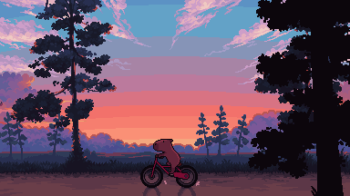
Imagine I have characters in a scene like this:

I made my canvas as small as possible (232 x 314), but just big enough to represent the features and have them be recognizable (it's Good Omens fanart 😤)!! If I had made it any bigger, I would be working on it for ever, due to how much more foliage I would have to render.
If you want to do an illustration and you're not sure, just start at somewhere around 100x100 - 200x200 and go from there.
It's perfectly okay to crop your canvas, or scale it up, or crunch your art down at any point if you think you need a different size. I do it all the time! It only takes a bit of cleanup to get you back to where you were.
🔸Where To Post
Outside of just regular socials, Twitter, Tumblr, Deviantart, Instagram etc, there are a few places that lean more towards pixel art that you might not have heard of.
⭐ Lospec Lospec is a low-res focused art website. Some pieces get given a 'monthly masterpiece' award. Not incredibly active, but I believe there are more features being added often.
⭐⭐ Pixilart Pixilart is a very popular pixel art community, with an app tied to it. The community tends to lean on the young side, so this is a low-pressure place to post with an relaxed vibe.
⭐⭐ Pixeljoint Pixeljoint is one of the big, old-school pixel art websites. You can only upload your art unscaled (1x) because there is a built-in zoom viewer. It has a bit of a reputation for being elitist (back in the 00s it was), but in my experience it's not like that any more. This is a fine place for a pixel artist to post if they are really interested in learning, and the history. The Hall of Fame has some of the most famous / impressive pixel art pieces that paved the way for the work we are doing today.
⭐⭐⭐ Cafe Dot Cafe Dot is my art server so I'm a little biased here. 🍵 It was created during the recent social media turbulence. We wanted a place to post art with no algorithms, and no NFT or AI chuds. We have a heavy no-self-promotion rule, and are more interested in community than skill or exclusivity. The other thing is that we have some kind of verification system- you must apply to be a Creator before you can post in the Art feed, or use voice. This helps combat the people who just want to self-promo and dip, or cause trouble, as well as weed out AI/NFT people. Until then, you are still welcome to post in any of the threads or channels. There is a lot to do in Cafe Dot. I host events weekly, so check the threads!
⭐⭐/r/pixelart The pixel art subreddit is pretty active! I've also heard some of my friends found work through posting here, so it's worth a try if you're looking. However, it is still Reddit- so if you're sensitive to rude people, or criticism you didn't ask for, you may want to avoid this one. Lol
🔸 Where To Find Work
You need money? I got you! As someone who mostly gets scouted on social media, I can share a few tips with you:
Put your email / portfolio in your bio Recruiters don't have all that much time to find artists, make it as easy as possible for someone to find your important information!
Clean up your profile If your profile feed is all full of memes, most people will just tab out rather than sift through. Doesn't apply as much to Tumblr if you have an art tag people can look at.
Post regularly, and repost Activity beats everything in the social media game. It's like rolling the dice, and the more you post the more chances you have. You have to have no shame, it's all business baby
Outside of just posting regularly and hoping people reach out to you, it can be hard to know where to look. Here are a few places you can sign up to and post around on.
/r/INAT INAT (I Need A Team) is a subreddit for finding a team to work with. You can post your portfolio here, or browse for people who need artists.
/r/GameDevClassifieds Same as above, but specifically for game-related projects.
Remote Game Jobs / Work With Indies Like Indeed but for game jobs. Browse them often, or get email notifications.
VGen VGen is a website specifically for commissions. You need a code from another verified artist before you can upgrade your account and sell, so ask around on social media or ask your friends. Once your account is upgraded, you can make a 'menu' of services people can purchase, and they send you an offer which you are able to accept, decline, or counter.
The evil websites of doom: Fiverr and Upwork I don't recommend them!! They take a big cut of your profit, and the sites are teeming with NFT and AI people hoping to make a quick buck. The site is also extremely oversaturated and competitive, resulting in a race to the bottom (the cheapest, the fastest, doing the most for the least). Imagine the kind of clients who go to these websites, looking for the cheapest option. But if you're really desperate...
🔸 Community
I do really recommend getting involved in a community. Finding like-minded friends can help you stay motivated to keep drawing. One day, those friends you met when you were just starting out may become your peers in the industry. Making friends is a game changer!
Discord servers Nowadays, the forums of old are mostly abandoned, and people split off into many different servers. Cafe Dot, Pixel Art Discord (PAD), and if you can stomach scrolling past all the AI slop, you can browse Discord servers here.
Twitch Streams Twitch has kind of a bad reputation for being home to some of the more edgy gamers online, but the pixel art community is extremely welcoming and inclusive. Some of the people I met on Twitch are my friends to this day, and we've even worked together on different projects! Browse pixel art streams here, or follow some I recommend: NickWoz, JDZombi, CupOhJoe, GrayLure, LumpyTouch, FrankiePixelShow, MortMort, Sodor, NateyCakes, NyuraKim, ShinySeabass, I could go on for ever really... There are a lot of good eggs on Pixel Art Twitch.
🔸 Other Helpful Websites
Palettes Lospec has a huge collection of user-made palettes, for any artist who has trouble choosing their colours, or just wants to try something fun. Rejected Palettes is full of palettes that didn't quite make it onto Lospec, ran by people who believe there are no bad colours.
The Spriters Resource TSR is an incredible website where users can upload spritesheets and tilesets from games. You can browse for your favourite childhood game, and see how they made it! This website has helped me so much in understanding how game assets come together in a scene.
VGMaps Similar to the above, except there are entire maps laid out how they would be played. This is incredible if you have to do level design, or for mocking up a scene for fun.
Game UI Database Not pixel-art specific, but UI is a very challenging part of graphics, so this site can be a game-changer for finding good references!
Retronator A digital newspaper for pixel-art lovers! New game releases, tutorials, and artworks!
Itch.io A website where people can upload, games, assets, tools... An amazing hub for game devs and game fans alike. A few of my favourite tools: Tiled, PICO-8, Pixel Composer, Juice FX, Magic Pencil for Aseprite
🔸 The End?
This is just part 1 for now, so please drop me a follow to see any more guides I release in the future. I plan on doing some writeups on how I choose colours, how to practise, and more!
I'm not an expert by any means, but everything I did to get to where I am is outlined in this guide. Pixel art is my passion, my job and my hobby! I want pixel art to be recognized everywhere as an art-form, a medium of its own outside of game-art or computer graphics!
This guide took me a long time, and took a lot of research and experience. Consider following me or supporting me if you are feeling generous.
And good luck to all the fledgling pixel artists, I hope you'll continue and have fun. I hope my guide helped you, and don't hesitate to send me an ask if you have any questions! 💕
My other tutorials (so far): How to draw Simple Grass for a game Hue Shifting


-
 hsyrlt liked this · 1 week ago
 -
 thegreatwizardelwin liked this · 1 week ago
 -
 jcf9231 liked this · 1 week ago
 -
 munkegutz reblogged this · 1 week ago
 -
munkegutz liked this · 1 week ago
-
 staygoldralph reblogged this · 1 week ago
 -
 defencelessdevotion liked this · 1 week ago
 -
 itz2manyfandoms liked this · 1 week ago
 -
 tamslop reblogged this · 1 week ago
 -
 nomewithoutyou liked this · 1 week ago
 -
 lightsup333 liked this · 1 week ago
 -
 littlemissloveyou liked this · 1 week ago
 -
 sweetestcreaturehl liked this · 1 week ago
 -
 blackcloverenthusiast liked this · 1 week ago
 -
 anathemaddie liked this · 1 week ago
 -
 karlithemuse reblogged this · 1 week ago
 -
karlithemuse liked this · 1 week ago
-
 subway-sandman liked this · 1 week ago
 -
 noromewithoutsilvia liked this · 1 week ago
 -
 lilmia-casand reblogged this · 1 week ago
 -
lilmia-casand liked this · 1 week ago
-
 shining-dawn liked this · 1 week ago
 -
 faithinthfutures liked this · 1 week ago
 -
 mrs506 reblogged this · 1 week ago
 -
mrs506 liked this · 1 week ago
-
 azuzuwrites reblogged this · 1 week ago
 -
azuzuwrites liked this · 1 week ago
-
 lizzylizzyinatizzy reblogged this · 1 week ago
 -
 ghosthere02 reblogged this · 1 week ago
 -
 princessoulh liked this · 1 week ago
 -
 tragedytells-tales liked this · 1 week ago
 -
 janus-echo reblogged this · 1 week ago
 -
 roadrunner1896 reblogged this · 1 week ago
 -
 thinkandwishandhopeandpray liked this · 1 week ago
 -
 sydneysandshoes liked this · 1 week ago
 -
learningtowritereference reblogged this · 1 week ago
-
 bracefacefreak liked this · 1 week ago
 -
 nin13os liked this · 1 week ago
 -
nin13os reblogged this · 1 week ago
-
 friszil liked this · 1 week ago
 -
 louisithink liked this · 1 week ago
 -
 esbettus liked this · 1 week ago
 -
 asterlizard liked this · 1 week ago
 -
 gayangeltrap liked this · 1 week ago
 -
 thenebulousthey reblogged this · 1 week ago
 -
 so-why-let-your-voice-be-tamed reblogged this · 1 week ago
 -
 ophiocordyceps-unilateralis liked this · 1 week ago
 -
 recmeidareya reblogged this · 1 week ago
 -
recmeidareya liked this · 1 week ago

sideblog for @letardoursprout so i have somewhere to collect all the tutorials/advice that i likeicon by lovelyshiz. header by hexh-pixel
66 posts