Experience Tumblr Like Never Before
The Man In Black - Blog Posts
I took a quick look without my glasses, and I thought I saw Johnny Cash.


@dastmalchian and @lklinger221 at the @noholibrary presentation of "Dracula's Guest" on Oct 27


Part 4/6 - Buttercup and Westley
Part 1 - The Family | 2 - Style | 3 - The Sicilian Assassins | 5 - The Prince and the Count | 6 - Florin Castle
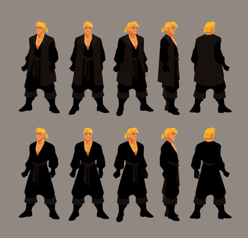
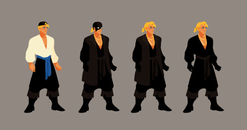
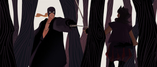
I wanted to make it very clear that the man in black / Westley is a pirate. So I used loose billowy clothes that also made him feel bigger and intimidating.
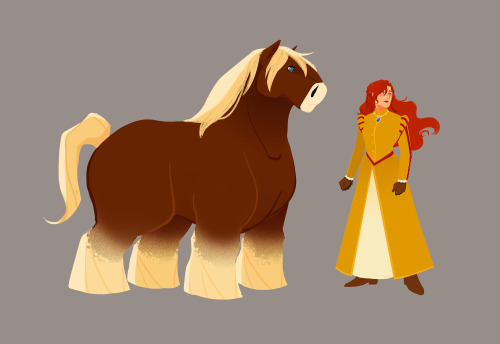
Horse is a Jutland horse, native to Denmark (which is what’s in between Sweden and Germany). It’s a draft horse, so good for farming, which is where Buttercup grew up, on a farm. I also wanted Horse and Westley’s design to somewhat mirror each other. Since Buttercup grew up on a farm, I did not want her to look dainty.
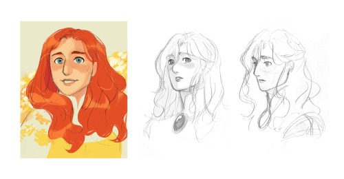
Buttercup’s story is more than just about love, it’s also about freedom. I realised that freedom was the core to her character. Her horse riding, doesn’t care what others think, and wild personality is all about freedom. I wanted her hair to flow with the wind, for her and her hair feel full of life. In the book, Buttercup had red hair. For her to have such a bold hair colour, especially one that in Europe during the medieval period was not considered desirable, felt right. Her hair and her personality is a defiance to the standard of beauty and of how a woman “should” be. That someone as bold as her would be considered the most beautiful woman in the world felt pretty badass. Having red hair (kinda vermillion) also provided opportunity to work with Humperdinck’s more blood red. When wearing her presentation dress as Princess of Hammersmith (despite the title of Princess, it is a title that does not sound dainty), Humperdinck’s red on her dress subdues the boldness of Buttercup’s red hair. Combining this with a restrictive design for her presentation dress and of her hairstyle, her design become reflective of her situation as a prisoner.
But when on her daily ride her dress can flow and her bright, bold, red hair is free.


Part 3 - The Sicilian Assassins
Part 1 - The Family | 2 - Style | 4 - Buttercup and Westley | 5 - The Prince and the Count | 6 - Florin Castle
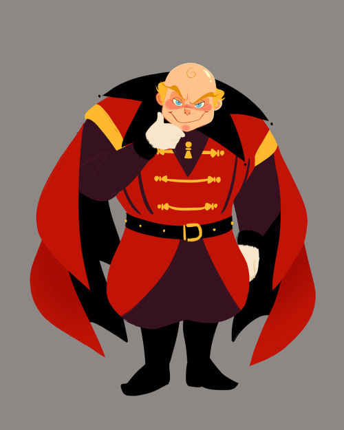
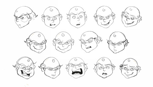
With Vizzini I was trying to combine the feeling of baby angels from old renaissance paintings, sinister-ish expressions, and ringmaster, plus dash of gaudiness. I made Vizzini prominently red so that there would be a transfer of association from Vizzini in the first half to Humperdinck in the latter half. The colour red and the pawns on his design apart from being on theme for his character can also serve as foreshadowing, that he is not the overarching antagonist.
Sometimes due to Fezzik’s backstory of working in Greenland, people mistake him for being Greenlandic but it was clearly stated that Fezzik is a Turkish wrestler. It was important that his design made it very clear that he was not European. In the books, he is described as hairy, large, and gorilla-like in appearance. By dividing his head into three sections (upper head, cheeks, and mouth-chin) keeping the graphic shape of his head across different angles was made easier. To determine the direction of Fezzik’s overall design the emphasis was established (his arms), inspiration was taken from circus strongmen, then combined with a strong but soft and lovable feeling.
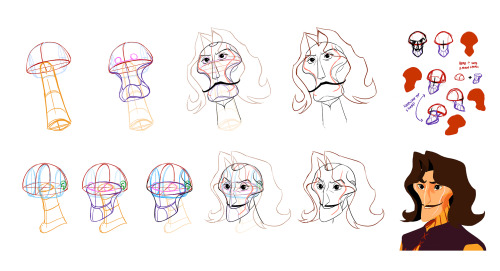
The general direction of Inigo’s features was clear early on, but his head shape did undergo many iterations. His final head shape design has a clear and readable graphic iconography even in different angles. Its iconic integrity is easily maintained but can be difficult to draw, because of that a diagram was made to show how the structure of his head.
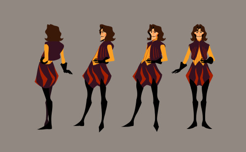
It was important to make sure Inigo and the man in black's silhouettes were distinguishable from one another. So I tried to pull their designs in opposite directions. Inigo's leaning towards a more slender swish-flick feel and the man in black's to a larger, billowy, and intimidating direction.