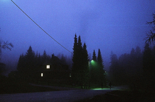
Night Drive

Night drive
More Posts from Arrikiwinslow and Others
Grids and Layout
Grids are the skeleton that a layout is built upon. This helps organisation, readability, to produce the piece easier and quicker, easier for collaboration, easier to balance the design, creates an easy to make multi-page layout with consistency, enhances visual hierarchy, creates a starting point for your design and can be used to break the rules for impact. There is a full anatomy to a grid:

Format - the full area/space for all the elements.
Margin - space between the content and the edge.
Flowlines - to line up the text correctly.
Modules - space between the vertical and horizontal gutters
Spacial Zones - multiple modules
Columns - vertical spacial zones
Rows - horizontal spacial zones
Gutters - spaces between the rows and columns. And making them equal creates visual balance
There are also types of grid:

Baseline - consistent typography size and leading. Mostly used for novels.
Manuscript - a large rectangular area which is good for continuous elements of text. A narrow box means a focus on the eye.
Column - useful for pull quotes and they could be regular or irregular for variations.
Modular - vertical and horizontal divisions. Useful for small chunks of information and to create spacial zones.
Hierarchical - Loose and organic grids which create more freedom and can unify different elements.
Pixel - useful for design on screen.
This lecture was useful by showing me key types of grids and layouts which I can refer to in my practice now and in the future to create successful editorial layouts.

Los Gorriones is the first single of Ádan Sánchez Band. Release on 27/03/2024. @adancarito @adan_sanchez_band . . .
⭕️ Pre-orders. https://amazon.com/music/player/albums/B0CXYZX2XB?marketplaceId=ATVPDKIKX0DER&musicTerritory=US&ref=dm_sh_iiJ9OZV0JvFK2pPQKroMzTBFg

Charles Burns


Alvin Lustig (1940) • Typographical illustrations for 'The Ghost in the Underblow' Book
#graphicdesignwow #american graphic design #alvin lustig #1940


Hedonismo for REMIX Magazine Photography : Tatu García Collage : Lola Dupre Stylists : Pamela Martinelli & Milva Russo Make up artist : Melina Acuña Hair Stylist : Florencia grosso for Melina Acuña make up Studio Models : Benagy Benoit @ Visage Models, Manuela Hidalgo & Lemylie Sozah Photo Retouching : Tuco Studio Collage Retouching : Alina Kovban
Project details and garment credits on Behance: https://www.behance.net/gallery/40734263/Hedonismo-for-REMIX-Magazine

My friend Charlie read this article (The Insane History of Polish Movie Posters) the other day and ended up sending me a print of one of them, because he knew I'd like it, and he was obviously right. I was so excited to display it I whacked it on the nearest available surface, hence why it's currently hiding behind M&S vouchers. I didn't clock this initially, I was so taken in by the colours, but from the top of the stairs (and a little bit in this picture too) it looks like a face. It's great.

I promise not to turn this into a Polish Poster Blog, but another one of my favourites is the poster for "Who's Afraid of Virginia Woolf?" by Franciszek Starowieyski. I have a print of it somewhere. I'll level with you - it's quite ugly! You'd think one of the keystones of good design is that the item is pleasing to look at, and this is anything but, so how exhilarating that an artist has the freedom to create something which doesn't conform to that expectation? I think it catches your attention, which makes it very effective nevertheless. For a start, when I saw it on eBay I couldn't stop thinking about it until I purchased it.
Here's the article, and I recommend reading it if only to find out the fascinating reason behind why communist Poland had such a vibrant movie poster design culture.


Gil J. Wolman - ‘L’anticoncept’ - 1952 film

-
 managerrandolph014 reblogged this · 1 week ago
 -
 name-change liked this · 1 week ago
 -
 thexoelove reblogged this · 1 week ago
 -
 maninblvck reblogged this · 1 week ago
 -
 peaceispriceless1 liked this · 1 week ago
 -
 fxckshxtup reblogged this · 2 weeks ago
 -
 antidxynx reblogged this · 2 weeks ago
 -
 pursuit-perfections liked this · 2 weeks ago
 -
 ihopeucomehomesoon liked this · 2 weeks ago
 -
 twfu reblogged this · 2 weeks ago
 -
 telesangelism reblogged this · 2 weeks ago
 -
telesangelism liked this · 2 weeks ago
-
 belgian-idiot liked this · 2 weeks ago
 -
 only-my-and-myself reblogged this · 2 weeks ago
 -
 midnightkissing liked this · 2 weeks ago
 -
 lostafraid liked this · 3 weeks ago
 -
lostafraid reblogged this · 3 weeks ago
-
 goldanddark reblogged this · 3 weeks ago
 -
 wes-luz reblogged this · 3 weeks ago
 -
wes-luz liked this · 3 weeks ago
-
 bubamala liked this · 3 weeks ago
 -
 experiemce reblogged this · 3 weeks ago
 -
experiemce liked this · 3 weeks ago
-
 intheirhonor reblogged this · 3 weeks ago
 -
 nuramakizgin reblogged this · 3 weeks ago
 -
 thruthepeephole liked this · 4 weeks ago
 -
 rainsticks liked this · 4 weeks ago
 -
 fractalsausage reblogged this · 1 month ago
 -
 clockgirl94 liked this · 1 month ago
 -
 bioshocked-astroghost liked this · 1 month ago
 -
 armand-dearest reblogged this · 1 month ago
 -
 anaimlesswanderer reblogged this · 1 month ago
 -
 madommii liked this · 1 month ago
 -
 phobic-human liked this · 1 month ago
 -
 clsscspk reblogged this · 1 month ago
 -
 whole-hole-hold reblogged this · 1 month ago
 -
 dejavume reblogged this · 1 month ago
 -
dejavume liked this · 1 month ago
-
 our-work-ethic-is-shit reblogged this · 1 month ago
 -
 ginger-men-and-garlic-bread reblogged this · 1 month ago
 -
 cl0udiaa liked this · 1 month ago
 -
cl0udiaa reblogged this · 1 month ago
-
 tothelighthouse1 liked this · 1 month ago
 -
 echoesunraveled reblogged this · 1 month ago
 -
echoesunraveled liked this · 1 month ago
-
 sillymilly17 liked this · 1 month ago
 -
sillymilly17 reblogged this · 1 month ago
-
 kaehermoso reblogged this · 1 month ago
 -
 deceivrmm liked this · 1 month ago
81 posts