Grids And Layout
Grids and Layout
Grids are the skeleton that a layout is built upon. This helps organisation, readability, to produce the piece easier and quicker, easier for collaboration, easier to balance the design, creates an easy to make multi-page layout with consistency, enhances visual hierarchy, creates a starting point for your design and can be used to break the rules for impact. There is a full anatomy to a grid:

Format - the full area/space for all the elements.
Margin - space between the content and the edge.
Flowlines - to line up the text correctly.
Modules - space between the vertical and horizontal gutters
Spacial Zones - multiple modules
Columns - vertical spacial zones
Rows - horizontal spacial zones
Gutters - spaces between the rows and columns. And making them equal creates visual balance
There are also types of grid:

Baseline - consistent typography size and leading. Mostly used for novels.
Manuscript - a large rectangular area which is good for continuous elements of text. A narrow box means a focus on the eye.
Column - useful for pull quotes and they could be regular or irregular for variations.
Modular - vertical and horizontal divisions. Useful for small chunks of information and to create spacial zones.
Hierarchical - Loose and organic grids which create more freedom and can unify different elements.
Pixel - useful for design on screen.
This lecture was useful by showing me key types of grids and layouts which I can refer to in my practice now and in the future to create successful editorial layouts.
More Posts from Arrikiwinslow and Others


Gil J. Wolman - ‘L’anticoncept’ - 1952 film

Winter Ghost Real Estate
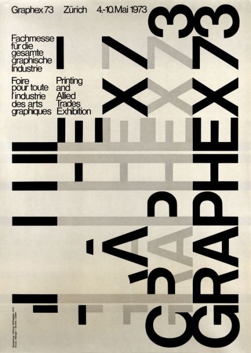
Othmar Willisegger, Graphex 73, 1973
(via selectedwork)

via weheartit


NIGHT DRIVE.
Grids and Layout
Grids are the skeleton that a layout is built upon. This helps organisation, readability, to produce the piece easier and quicker, easier for collaboration, easier to balance the design, creates an easy to make multi-page layout with consistency, enhances visual hierarchy, creates a starting point for your design and can be used to break the rules for impact. There is a full anatomy to a grid:
Format - the full area/space for all the elements.
Margin - space between the content and the edge.
Flowlines - to line up the text correctly.
Modules - space between the vertical and horizontal gutters
Spacial Zones - multiple modules
Columns - vertical spacial zones
Rows - horizontal spacial zones
Gutters - spaces between the rows and columns. And making them equal creates visual balance
There are also types of grid:
Baseline - consistent typography size and leading. Mostly used for novels.
Manuscript - a large rectangular area which is good for continuous elements of text. A narrow box means a focus on the eye.
Column - useful for pull quotes and they could be regular or irregular for variations.
Modular - vertical and horizontal divisions. Useful for small chunks of information and to create spacial zones.
Hierarchical - Loose and organic grids which create more freedom and can unify different elements.
Pixel - useful for design on screen.
This lecture was useful by showing me key types of grids and layouts which I can refer to in my practice now and in the future to create successful editorial layouts.


By: Anto - Tweet
-
 blaue3 liked this · 4 years ago
 -
 arrikiwinslow reblogged this · 4 years ago
 -
 ihaveawaronmymind liked this · 4 years ago
 -
 sswamphag liked this · 4 years ago
 -
arrikiwinslow reblogged this · 4 years ago
-
arrikiwinslow liked this · 4 years ago
-
 amber-l-art reblogged this · 4 years ago
81 posts