Good Omens And The Forbidden Book Last Chapter


Good omens and the Forbidden book last chapter
At times life can be tough, you miss your family and friends, a sense of loneliness seems to always accompany you. But there’re always an angel and a demon and loved ones who watch over you.
This is it, the end of the journey. The story began and ended with an angel and a demon. I’ll let you decide what you can take away from this. In any way it’s been such an experience.
Thank you for enjoying my story so far. I will work on completing the file and look for a distributor so you guys can have a physical copy. There’s also a digital copy for it, book marks and stickers that I will draw as well.
For newer fans to the fandom or you guys who haven’t got the chance to buy older books, I probably will resell them as well, just let me know 😊
Previous chapter

More Posts from Lousnaps and Others
Gabz talks briefly about production design and how it represents and reflects characters and story, part 1/?:
CROWLEY’S FLAT/AZIRAPHALE’s BOOKSHOP vs. HELL/HEAVEN
Alright, so I’ve seen a couple posts about how Crowley and Aziraphale’s living spaces are contrasts of their respective head offices of Hell and Heaven. I also found this contrast to be extremely interesting and it didn’t occur to me at first until I saw Crowley’s flat.


So let’s start with Crowley’s flat. It’s sparse and open. Hell is crowded and cramped. The very fact that he has a flat designed this way, his own space, speaks to his uncomfort with the confinement and claustrophobic nature of Hell’s environment. His flat is minimalistic, but it’s methodical. The climate of Hell is connected to the space it occupies, so for Crowley the way to separate himself from that is to use the power he has being on earth to design himself a space diametrically opposed to Hell. It’s a safe space, breathing room (well, until Hastur and Ligur try to disrupt that). It’s freeing and freedom is something Crowley craves constantly (his insistence on running away). It’s not that he likes the empty privacy of his flat because he clearly doesn’t like to be alone. It’s the sheer fact that his flat creates a physical and psychological separation from Hell.


And many of the same things can be said about Aziraphale’s bookshop. It’s very intimate and filled to the brim with books. Heaven, on the other hand, is empty and vast. There is a cold and clinical feel to Heaven that leaves Aziraphale feeling uncared about. He is an entity of love, after all. He has a genuine warm and friendly personality that has been dilated and warped by the need to maintain the Heaven facade in front of his superiors. His bookshop is an extension of the love he feels - for books, for knowledge, for humanity, etc - and it helps him to retain that warmth that is lacking in Heaven. His space is designed to shelter himself, relieving the anxiety that the environment and structure of Heaven consistently causes him. The empty space leaves Aziraphale feeling exposed and under observation where expectations can never be met.
Both Crowley and Aziraphale’s living spaces are important to the overall story because they represent the rejection of the environments that they have been forced into, and they reflect the emotional and psychological need for a safe space/escape. Another potent piece of this is choice. Their earthly spaces are designed according to how they want them to be, while they have no control over the spaces of their head offices.
So yeah, there’s some brief thoughts. I didn’t even get into location or color palettes of these spaces. I might have to write about that next…


aziraphale’s knowledge of emojis is low key as extensive as michael sheen’s, while crowley is just as clueless as david tennant and that’s the tea
more ineffable husbands ( x ) and ( x )

sorry if this has been asked before, but i wanted to ask about your lineart! the weight and line economy are just so nice, i get stars in my eyes looking at your lineart and doodles. could i ask what your approach to lineart is and what tips you might offer?

Wow I love these questions - Line is so interesting!!! It's a really big topic so I feel like any tips I give will be just barely scratching the surface. It's like deceptively simple...any given line drawing is essentially taking all the information we glean from seeing something irl ie light, shadow, dimension, texture, perspective, etc and boiling it down to the simplest possible visual information.
I think most commonly my line is informed by light source so like. thicker more continuous lines face away from the light and thinner more broken lines towards. and a lot of my spot blacks r simply cast shadows.

here's a more extreme example

BUT like everything to do with art there's no hard and fast rules. I use blacks when I think it'll be effective or interesting and I leave them out when I don't need em. umm couple things I find myself doing a lot... using spot blacks to make the separation between characters clearer. I like casting shadow in between characters so its easy to separate and read their silhouettes even when they're mashed together.

u can go even further to purposely create a silhouette like

to draw attention to a finger or tongue LOL. There's some comic book artists who are absolute masters at this type of stylization. Alex toth and his spiritual successor Chris samnee come to mind for me right away.

(toth)


(samnee)
I feel like I'm also often using line weight to separate planes receding in space

im naturally a really heavy handed and scribbly drawer(...?) draftsman. and im nearsighted so when i see things i percieve and break it down into big shapes over thin contours. so stuff like spot blacks and shadows came easy to me, the tricky part was making the rest of the lines lighter when they needed to be so the blacks could actually have impact LOLL. a lot of effective visual communication is about balancing contrasts. like I had to really train myself to press less hard on the pen. I think this is actually really evident if u go back in my archive to older sketches LOL


I actually feel like a lot of how I trained my hand to tackle line weights was thru stuff like hand lettering where you rly have to focus on being sensitive to that kind of thing.. contrasting strokes etc.

also exercises like figure drawing will have you flexing those muscles constantly


I'm starting to just regurgitate lessons from freshman year of art school so I'll stop here with the demos but yeah...I hope this was helpful!? I love line!!! I want to get even better at line work so I can feel confident posting work that's only line no color or value... I'll leave you with a bunch of artists who I think have particularly expressive and beautiful linework (not including toth and samnee who I already mentioned and who's work I love so much). You can probably learn much more from them than you can from me...!

Charles dana gibson LOL


Matias bergara


tonci zonjic

naoki urasawa

Daniel warren johnson


shiyoon kim


michel breton
also yoji shinkawa, tomer hanuka, leo romero, I feel like I'm gonna post this and think of so many more. there's so many good artists...!


bat (st)eddie shenanigans w/ dustin

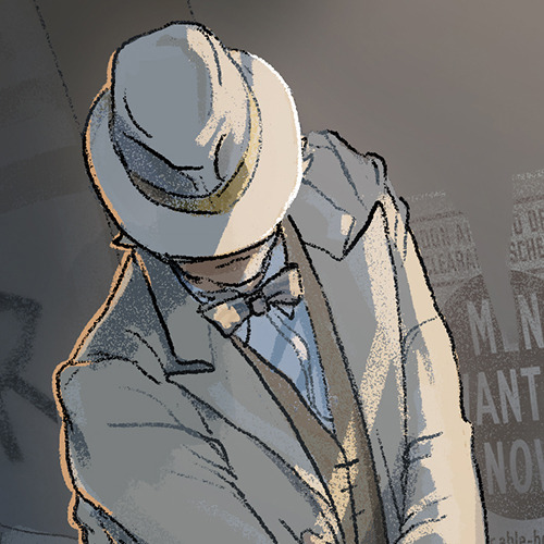
Hello, here is my piece for Ineffable Eras Zine - Blitz 1941! Actually, this is my very first entrance to fanzines. When I got my acceptation mail from mods, I was literally SCREAMING of joy. You can’t imagine the amount of happines I felt, I still feel. Like, fck, they really want me, oh, jolly good, I’m in, I’M IN. By the way, I’ve enjoyed the whole work process, from sketching main idea on the paper, searching references (I say just one word: HATS), playing with colors and posters on wall to adding last touches. I want to thank to mods for having me, to other artists for helping me with art issues and also for sharing their wips (I saw each one of them at advance hahaha) and to everyone for having great fun and talk on discord chanel. Great times, really. Thank you xxx P.S. I forgot Crowley’s sunglasses, shame on me.


HEARTSTOPPER | 1x02: “Crush” Script by Alice Oseman

Recently I’ve been reading a lot of Tintin comics after watching the 2011 CGI film, so here’s my rendition of the beloved characters!

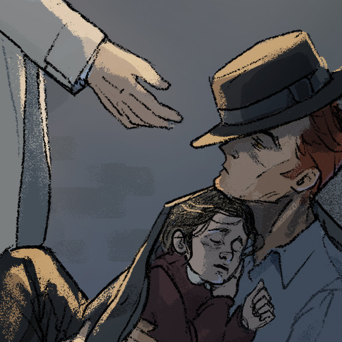
Good Omens, Adam Young the Antichrist and Dog, Hellhound.
there’s discomfort everywhere…
-
 lucolega liked this · 1 week ago
 -
 queen13card liked this · 1 week ago
 -
 sketchyisa liked this · 1 week ago
 -
 futuristichideoutinternet liked this · 2 weeks ago
 -
qualitycloudlove liked this · 3 weeks ago
-
 sahimr liked this · 3 weeks ago
 -
 parkerdo3sart liked this · 1 month ago
 -
 sophisticated123 liked this · 1 month ago
 -
farizhafy reblogged this · 1 month ago
-
farizhafy liked this · 1 month ago
-
 kilgarraghforever liked this · 1 month ago
 -
 tolkien-addiction liked this · 1 month ago
 -
 fridaywormteeth reblogged this · 1 month ago
 -
 lawmonade liked this · 1 month ago
 -
 koperek-w-pude1ku-po-1odach liked this · 1 month ago
 -
dablyatsukaaa liked this · 1 month ago
-
fridaywormteeth liked this · 1 month ago
-
 fumenia-yuza liked this · 2 months ago
 -
 ranaeley liked this · 2 months ago
 -
 mydysfunctionallife liked this · 2 months ago
 -
 astudyintheburningofhearts liked this · 2 months ago
 -
 ravensrandomcorner reblogged this · 2 months ago
 -
 purplemarivide liked this · 2 months ago
 -
 nah78 liked this · 2 months ago
 -
 moonlight-puppet liked this · 2 months ago
 -
 grexnish liked this · 2 months ago
 -
 demiourgias liked this · 2 months ago
 -
 staraxolotl liked this · 2 months ago
 -
 rainbow-forests liked this · 2 months ago
 -
 vintagelilys liked this · 3 months ago
 -
 sugerbunny liked this · 3 months ago
 -
sasshura-blog liked this · 3 months ago
-
 supertrashycolors liked this · 3 months ago
 -
ebellz-blog1 liked this · 3 months ago
-
 fffroggy liked this · 3 months ago
 -
 potato-physics liked this · 3 months ago
 -
 kir-o liked this · 3 months ago
 -
 forgetaboutme liked this · 3 months ago
 -
 3a-u-r-o-r-e3 liked this · 3 months ago
 -
 pinggypinguin liked this · 3 months ago
 -
 the-cord10 liked this · 3 months ago
 -
 circuits17 liked this · 3 months ago
 -
 lunacrazyy liked this · 3 months ago
 -
 ashedflower liked this · 3 months ago
 -
 tsuki5-tempura liked this · 4 months ago
 -
 shipshifting-monster liked this · 4 months ago
 -
 pingusomens liked this · 4 months ago
 -
 unangepredateur liked this · 4 months ago
 -
 emma263646 liked this · 4 months ago
 -
 gardenengineerishere liked this · 4 months ago
