** Permission To Post It Was Granted By The Artist Do Not Repost/edit The Art Without Permission Please,

** Permission to post it was granted by the artist Do not repost/edit the art without permission Please, support the artist on their pages too **
Artist : 湊 (pixiv / twitter)
Source
More Posts from Etherealgrape and Others
OMGGGGGG

Changelle accepted @etherealgrape drawed this and I colored it, took me only a day. It’s my first try trying to color in line art \( 'ω')/
Sorry I messed up on yuu hair and don’t know how to link


Tutorial and or tips in color studies?
Hi there! Sorry to keep you waiting on this ask!
I do have another post about landscape painting which overlaps slightly with this. But here I’ll talk specifically about the observational color studies I like to do. Other artists might have different ways of approaching them (and I still have a lot to learn myself), but these are some of the ideas I’ve found useful.
1. Don’t seek perfectionObservational color studies are just that – studies. Sketches. Note-taking to reference later. They’re not supposed to be complete paintings, so you shouldn’t feel pressured to make them “perfect”. I like posting them sometimes (and hopefully you like seeing them) but there are TONS of messy, scribbly studies I haven’t posted anywhere. They’re primarily a tool to help me learn, and if messy studies help me learn, so be it!

2. Simplify your shapesSo how do you avoid getting overwhelmed and lost in the details? Focus on the BIG IDEA. Decide what is most important to include in the study and leave out everything else. Start with big shapes, and add details at the very end, if you have time. Personally, I’m often interested in the sky and the color clouds become when light passes through. So I might make the study about the clouds and ignore buildings/details on the ground. or I’ll add only a very simple ground plane. Other times, I’ll rearrange a composition to include all the important information (like making an object bigger or smaller, or bringing two objects closer together).

3. Step by stepIt helps to find a good workflow, especially when you have to quickly prioritize what information to include. This is relevant especially when you’re painting something like a sunset, when the light changes RAPIDLY and you’ll have only 3, 4, 5 minutes to put your colors down. For me, this usually means I build my study from background to foreground: sky, clouds, ground plane, background shapes, foreground shapes. Since I work on iPad Pro, I also keep those parts separated out into layers. In the case of those quick sunset studies, I also observe the parts I haven’t painted yet in case the lighting changes enough that I’ll need to work from memory.

4. Some fundamentals to keep in mind:
Value structure: Even though these are color studies, value plays a major role in the colors you’re observing. Pay attention to the difference in value between subjects. Sometimes this can solve color-related problems when your study seems “off” somehow. (For example, maybe that sky isn’t as light as you think it is? A darker value might mean painting a more vibrant color.)


Lighting setup: Identify the different light sources in the environment. Is it cloudy and overcast? Sunny? Are you indoors, with multiple different light sources? A little study about lighting theory can really help you know what colors to look for in different lighting conditions. For example, in overcast light, you’ll see more of the objects’ local color, while in bright sunlight you’ll see a strong direct light (the sun), blue diffused light on shadows and top-facing planes (from the blue sky), and a warm bounce light (from sunlight reflecting off the ground). Will forever recommend James Gurney’s book “Color and Light” for help learning this.

Materials: Different materials reflect light sources in different ways. Being aware of how light passes through or reflects off different materials can help you understand the colors you’re seeing.
5. Going beyondAs you become more comfortable making observational studies, the more you might wish to push them even further by not just copying from life but communicating a feeling. A few ways you might accomplish this:
Exaggerate your colors. Suppose you see a hint of color you wouldn’t normally expect to find, such as notes of purpose or red near the horizon of an otherwise blue sky. Try making it brighter/bolder than you really see it. Bump up the saturation, maybe. This is a delicate balance, as you don’t want to exaggerate to the point where the colors become garish. But putting emphasis in certain places can remind yourself, or show whoever’s looking at your study, that you found certain details interesting.

Think about mood. A color script from an animated film follows the emotional beats of the story. As you’re making your studies, consider: how does this moment feel to me? Take a cloudy scene, for instance. Is it cold and miserable? Windy, full of movement and energy? Calm? Dark and ominous? A moment of anticipation or hope with the clouds about the break apart? Each of those conveys a completely different mood. So you might decide upon one and push your color palette to support that idea.
Don’t just copy: communicate. This last one is a bit of an abstract idea I need an example to explain:

This sunset study here gave me difficulty because it involved not just color but the properties of light. The sun didn’t actually appear white to me - it appeared a bright red/pink color, glowing brighter than the sky around it. But that wasn’t something I could reproduce, because if I only painted the color, it wouldn’t appear glowing and would blend into the rest of the sky. Instead, I had to think critically: how do I communicate the brightness of this sun? In the end, I opted to make the sun white, with the color I actually observed the sun to be surrounding it.
On my Instagram, I’ve posted a lot of process videos to accompany my studies, if that interests anyone! They’re always second image on the studies’ posts.
I hope you find these thoughts helpful!

Owari no Seraph gets a center color in the April issue out on March 4th
(To celebrate volume 18 being released on the same day)


a softer world sentence starters.
theomachian:
❛ some people are so good at disappearing that you start to doubt your memories that they were ever there. ❜
❛ how do you say goodbye to someone who was never there? ❜
❛ i don’t want a world without pain, or loss. i just want them to mean something. ❜
❛ there are some people who believe a photo captures their soul. ❜
❛ if you love something let it go. ❜
❛ you were not the first, you will not be the last. ❜
❛ there are some secrets i will take to my grave, but i don’t want loving you to be one of them. ❜
❛ you can still back out before anyone gets hurt. ❜
❛ i said i’d love you forever, and really meant it at the time. i guess that’s my problem. ❜
❛ kindness won’t save anyone. ❜
❛ for a long time i thought i deserved better. but the truth is we both deserve better than this. ❜
❛ i wish there was a word that meant “goodbye” for someone who was already gone. ❜
❛ i never meant to hurt you. you have to believe me. ❜
❛ we’ll always have yesterday. ❜
❛ hope softens the rough edge of every promise. ❜
❛ love is stupid. happiness is admitting we aren’t better than stupid. ❜
❛ you can’t always want what you get. ❜
❛ i wish i had a dollar for every dollar’s worth of work i did. ❜
❛ we are empty inside and hollow. hoping something sweet will make its nest in us. ❜
❛ we’re too far from help. ❜
❛ monsters are even more scary when you see them afraid. ❜
❛ we carry our own loneliness with us. ❜
❛ fake happiness beats genuine misery. ❜
❛ they always trust me to be someone who i don’t even want to be. ❜
❛ i cannot see where i want to go, only that i want the going.❜
❛ you are never here. you are always almost there. ❜
❛ you and me will die the way we lived, telling ourselves stories to make it mean something. ❜

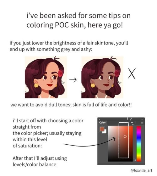
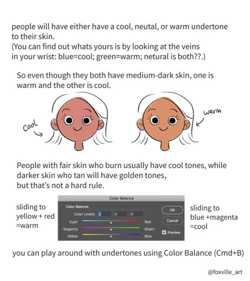
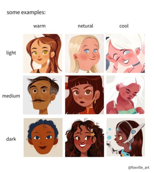
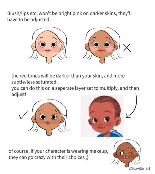

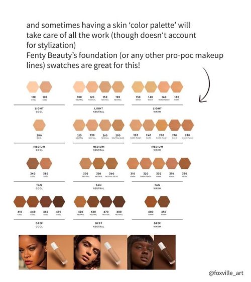
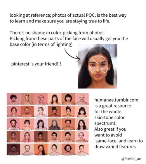
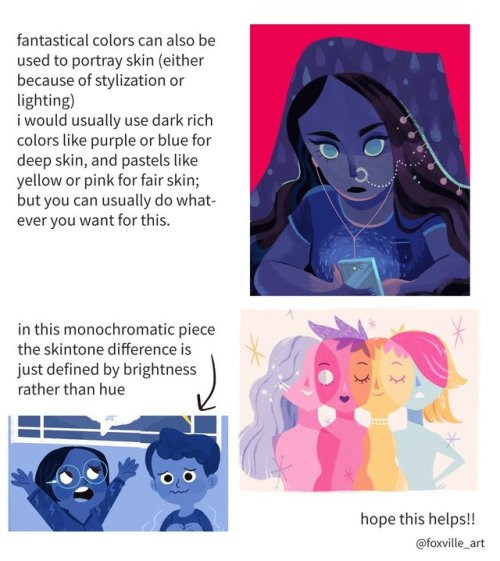
anoosha syed (foxville_art) on Twitter made a really interesting tutorial on how to colour non-white skin in illustrations that I thought people who follow this blog might find useful (:
(resposted with permission)
Have you ever wondered where books come from?
Well then, let me show you, because that’s what I do for a living.
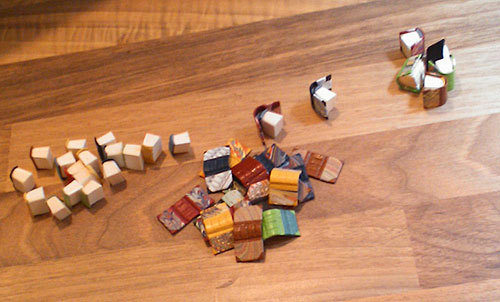
Right now, it’s this time of the year, and the little ones have just freshly hatched:

You’ll notice they’re still blind and naked when they hatch. So I make them little coats to keep them warm during their first winter:
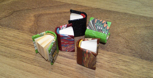
See how they happily line up to put them on:
See? Better. Now they’re ready to go and explore the world.
And if they make it through the winter and we take good care of them, they will grow up to be strong and wise like their older fellows:
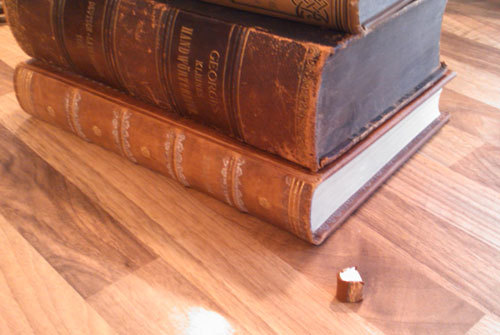
So, in case you were ever wondering, now you know.
-
 ivonnsworld liked this · 3 years ago
 -
 chihiro-thefox-cree liked this · 4 years ago
 -
 mikandhisprincess liked this · 4 years ago
 -
 childoftheimpossiblerevolution liked this · 4 years ago
 -
 spookystudentpicklepanda-blog liked this · 5 years ago
 -
 mireiko-chin liked this · 5 years ago
 -
 delanore03 liked this · 5 years ago
 -
 a-lil-bit-of-nothing liked this · 5 years ago
 -
 fujwow liked this · 5 years ago
 -
 aliceemely liked this · 5 years ago
 -
 mistick-master liked this · 5 years ago
 -
 77tanya77 liked this · 5 years ago
 -
 unreadeble liked this · 5 years ago
 -
 electronicwolfcalzonegiant liked this · 5 years ago
 -
 weepingscissorshandsdragon liked this · 5 years ago
 -
 jacilliam liked this · 5 years ago
 -
 belenpalma liked this · 5 years ago
 -
dashynia liked this · 5 years ago
-
 sweetignorantme liked this · 5 years ago
 -
 kit-kat-strawberry reblogged this · 5 years ago
 -
kit-kat-strawberry liked this · 5 years ago
-
 amesoeur-lover liked this · 5 years ago
 -
 intpthenerd liked this · 5 years ago
 -
 doelete liked this · 5 years ago
 -
 skimchocymilk liked this · 5 years ago
 -
 asmdr liked this · 5 years ago
 -
mandy-sha-blog liked this · 5 years ago
-
 sonyanoel20 liked this · 5 years ago
 -
sonyanoel20 reblogged this · 5 years ago
-
 necroyasha liked this · 5 years ago
 -
 mouseymozza liked this · 5 years ago
 -
 shenyueye liked this · 5 years ago
 -
 kuraxmasha liked this · 5 years ago
 -
 lucindaprice1161 liked this · 5 years ago
 -
 spinobean liked this · 6 years ago
 -
 kingatticus liked this · 6 years ago
 -
kingatticus reblogged this · 6 years ago
-
miles-sweet-prower liked this · 6 years ago
-
 0dusteil0 liked this · 6 years ago
 -
 andoria-chan liked this · 6 years ago
 -
 someonefullofcolors liked this · 6 years ago
 -
 undergroundllama reblogged this · 6 years ago
 -
 codaemaelui liked this · 6 years ago
 -
 tired-hot-mess liked this · 6 years ago
 -
 mika18 liked this · 6 years ago