A Couple Notes On How I Think About Lighting (& Mattes) For Storyboards That I Made A While Back While


a couple notes on how i think about lighting (& mattes) for storyboards that i made a while back while looking at student portfolios!
More Posts from Donutdomain and Others


did a quick colouring tutorial for someone so dropping it here
Art Tips for Vibrant Lighting
Some tips and tricks for getting glowy, beautiful, vibrant lighting effects…especially in traditional art, with no ctrl+z! The example piece is a watercolor work in progress of mine and, if you’re familiar with watercolor, you know it’s super unforgiving. What you put down stays!
Tip 1: Create a thumbnail

Do a very loose, messy sketch of your illustration. This helps define the composition, but it can also help you pick where your light is coming from and what colors you’ll use for it. This way, you can reference the light source and colors while you’re painting!
Even if you’re working digitally, this creates a great color key you can turn back to. You can make a thumbnail digitally or traditionally.
This thumbnail only took about 20 minutes…and it’s saved so many headaches during the painting process.
When you have a thumbnail, the rest of your painting is just a translation of those colors with a better technique.
Tips:
Feel free to make many thumbnails! This is the easiest step to revise and repeat.
Use a photo for inspiration for your color scheme. I used clouds in the evening as color references.
Play around with layers and effects (like overlay, multiply). This can help you figure out new colors that you can then try to capture traditionally!
Tip 2: Don’t forget about your lines!

Line art is important for gradients! I did mine first, so I had to consider the glow effect too. It’s a bit blurry (as its a screenshot from a reel, lol), but you can see yellows to dark browns and blacks. This established the glow from the start!
Tips:
Consider using a media you can get gradients in. I used acryla gouache here, but ink, watercolor, and even markers can work well!
If it’s hard to visualize highlights in line art, do the lines after with pen or paint! Adding shadows and highlights that way can be easier.
Tip 3: Start with big gradients first

Once you have your sketch on paper finished, start with large gradients! This helps define your light source and keep your whole composition making sense.
Here, I started with the background sky, then added in the shadow coming off the wing before doing anything else. Take note of how helpful the thumbnail was in helping me lay this all out, too!
Tip 4: Think warm to cool

See how both the hair and wings move from warm (yellow/browns) to cool colors (blues, payne’s grey)? This is a surefire way to keep the strong light source and make it look like the light is glowing!
Tips:
This is all about keeping the colors close to your light source, so if your light source is cool (like the moon), your highlights are cool and your shadows are warm tones. The key is just to keep it consistent!
Lighting isn’t just light to dark gradients. It’s also warm to cool/cool to warm!
Think about all the spots the light catches (like that one front feather on the left top). It takes a lot of thinking through, but it’ll make a huge impact! (Remember, you can always revisit your thumbnail or add more details in there)
Don’t forget about reflected light, bouncing off another surface. It’ll be more subtle than the main light source, but still there!

Final Tips:
Love those gradients! Watercolor is meant for beautiful gradients, so use multiple colors for a glow. The feathers in the light go from yellow ochre to prussian blue to payne’s grey.
Start with the highlights first, then work into the shadows! Above, the skin isn’t even painted with shadows yet, because I wanted to get the lighting first.
This is just a WIP right now, but I hope these tips help! If you want to follow, I’ll be posting more progress pics (and the finished illustration soon too). :D
My: Instagram | Twitter
HOW DO YOU SHADE THE GOLD PARTSS???? PSLSPSLPSLPSLS

You don't have to take my word as gospel but these are the things I found that work well: ♡
(Please excuse grammatical errors I wrote this with a headache-...)
In my personal experience and process with gold, I find that these few things help me a lot when tackling it:
-whenever you approach gold it's important to asses the medium in which the material presents itself. The two options are the metal itself and any type of golden fabric.
-the shading process for me begins right from the sketch, when mapping out the gold accessory, object or the accent on a piece of clothing I try to get the shape of it to make sense.


It's most important, with golden fabric, to know and imagine how it falls arround and wraps arround a silhouette or body parts, if you want to figure out shading.
-So, when we speak "golden clothing" it revolves arround very sharp shadows, lights and reflections mainly becouse of fabric wrinkles. Golden clothing is pretty easy once you understand the nature of your material-☆
And the rules apply to any other colour!


Original Yellow hue
♡Same rules apply♡
So if you want you can structure your lights and shadows in black, white and grey! It works well to start off if you're not confident with colours as gold can be tricky in that regard...
GREYSCALE- can help you better understand the intensity of lights and shadows in contrast with one another:

You can then focus on colour later after you set up your values.

You'll notice with gold pieces that are much less clothing and much more metal the shadows alter from soft to sharp depending on the physical structure of the object itself.
If you encounter smooth curves it's soft, when it's sudden cuts or edges it's sharp.
Important to keep in mind:
-Gold is a metal = metals are REFLECTIVE.

Metals will reflect light aswell as colours.
They will especially reflect ☆colorful lights.☆
You must always, always, know where the light source is, and how it hits the object/ material.
That's it for now but if you want a more detailed step by step process just ask ^^☆
-Nix🌙

Stars and Dust Across Corona Australis : Cosmic dust clouds cross a rich field of stars in this telescopic vista near the northern boundary of Corona Australis, the Southern Crown. Less than 500 light-years away the dust clouds effectively block light from more distant background stars in the Milky Way. Top to bottom the frame spans about 2 degrees or over 15 light-years at the clouds’ estimated distance. At top right is a group of lovely reflection nebulae cataloged as NGC 6726, 6727, 6729, and IC 4812. A characteristic blue color is produced as light from hot stars is reflected by the cosmic dust. The dust also obscures from view stars in the region still in the process of formation. Just above the bluish reflection nebulae a smaller NGC 6729 surrounds young variable star R Coronae Australis. To its right are telltale reddish arcs and loops identified as Herbig Haro objects associated with energetic newborn stars. Magnificent globular star cluster NGC 6723 is at bottom left in the frame. Though NGC 6723 appears to be part of the group, its ancient stars actually lie nearly 30,000 light-years away, far beyond the young stars of the Corona Australis dust clouds. via NASA
i learned that the north star is 4000 times brighter than our sun. The light we see when we look at the north star was generated in the year 1587, and it has been traveling through space for 434 years to reach us (x)

How to learn drawing MH monsters
Hey Anon! First of all I’m very honored, thanks a lot!!
You’re asking a very interesting question in my opinion, so I hope you will find a long response interesting as well c:
When I want to learn how to draw a new Monster, I base myself on the Monster’s design (ofc) but also on general knowledge, especially anatomy. Anatomy is crucially important even when drawing creatures that do not exist, simply in order to make them believable!
So if you struggle to draw MH Monsters, that are famous for their ‘realism’ and believability, first ask yourself what level you have in basic anatomy: if you know how skeleton works, muscles work, transcribing it into proportions and joints, things like that.
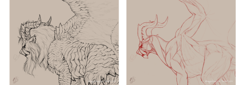
(Art I made for fun for my RP blog)
I sadly can’t offer you much advice on how to learn it, because anatomy is partly intuitive to me; and lots of my artistic anatomy studies were more centered around human anatomy (however, a lot of muscle groups are similar to animals, so even my knowledge of humans is useful when drawing monsters). I also have to mention I’m a vet student, and we had medical anatomy classes in the first year, which helped a lot as well; but I’m sure you can find online resources that will teach you the basics for art!
Keep reading

Egg Nebula
also known as RAFGL 2688 and CRL 2688, the Egg Nebula is located 3000 light years from Earth in the constellation of Cygnus.
The nebula is a bi-polar proto-planetary nebula, or essentially a star in the dying days of it's existence starting to throw out shells of atmosphere as it moves towards being a white dwarf.
The central star is concealed by an area of dust with the light poking out in areas where the dust is lightest, this is thought to be an accretion disk around the star.

Random Fact #3,062
The wind on Neptune can blow at speeds of 2,000 km/hour.

The winds causing the Great Dark Spot specifically have been measured to be around 1,127 km/hour.


-
 skeletons-and-roses liked this · 2 months ago
 -
 aliciasinferno liked this · 3 months ago
 -
 jadegato liked this · 3 months ago
 -
 futchbrownie liked this · 4 months ago
 -
 ariarandano liked this · 5 months ago
 -
 the-paracosmic reblogged this · 5 months ago
 -
 killjoy-prince reblogged this · 5 months ago
 -
 gillipop-plus reblogged this · 5 months ago
 -
 fartnuggetsworld liked this · 5 months ago
 -
 genericghostt liked this · 5 months ago
 -
 wolves-are-better-that-peope liked this · 7 months ago
 -
 lunammoon reblogged this · 7 months ago
 -
 kataang36 liked this · 7 months ago
 -
 komaedamizuki reblogged this · 7 months ago
 -
komaedamizuki liked this · 7 months ago
-
 kazel04 liked this · 8 months ago
 -
 spaghetti-aldente liked this · 8 months ago
 -
 brookpeirsunset liked this · 9 months ago
 -
 astronnonyy reblogged this · 9 months ago
 -
astronnonyy liked this · 9 months ago
-
 mortimer liked this · 10 months ago
 -
 hella-blog-stoof reblogged this · 10 months ago
 -
 lakeeriecreature reblogged this · 10 months ago
 -
 secretmagician liked this · 11 months ago
 -
 taievieu liked this · 1 year ago
 -
 beepbing liked this · 1 year ago
 -
 eggy-the-egg liked this · 1 year ago
 -
 twadi-gurl reblogged this · 1 year ago
 -
 whatthedip liked this · 1 year ago
 -
 lanakatte liked this · 1 year ago
 -
 thepoetjean-makes-stuff liked this · 1 year ago
 -
 rose-awsome26 liked this · 1 year ago
 -
 kick-itup liked this · 1 year ago
 -
 nth-soverei9n liked this · 1 year ago
 -
 one-cozy-red-pillow liked this · 1 year ago
 -
 frodho-slaggins liked this · 1 year ago
 -
 petite-lunalu reblogged this · 1 year ago
 -
 skys-fallin-baby reblogged this · 1 year ago
 -
skys-fallin-baby liked this · 1 year ago
-
 enigma-absolute reblogged this · 1 year ago
 -
enigma-absolute liked this · 1 year ago
-
 camillahuiguorou liked this · 1 year ago
 -
 thatonefan02 liked this · 1 year ago
 -
 gnome-hopper liked this · 1 year ago
 -
 galaxy79000 liked this · 1 year ago
 -
 ydrin reblogged this · 1 year ago
 -
 kallister-kaleidoscope liked this · 1 year ago
 -
 amdyy liked this · 1 year ago

I just reblog fun facts/tipsScience, nature, geology facts etc! + art & writing tips!
67 posts